
Introduction to Figma Auto Layout
With the arrival of Figma Auto Layout in 2019 came the possibility to create frames that automatically adjust spacing and alignment, making it possible to design responsive layouts. This Figma Auto Layout guide shows how using it effectively can speed up your workflow while making designs easier to manage and edit.
Figma’s introduction of Auto Layout also comes from the need to give designers a tool closer to how websites or applications are built. In short: instead of a canvas where you just place buttons and graphics, you now have a series of containers (frames), which simulate the use of div tags. Auto Layout essentially mimics the CSS property display: flex;, and so on.
Learning how to use Auto Layout in Figma is very useful also because the website builder Framer uses the same logic, allowing for a high level of design fidelity when moving from design to development.
How to Add Auto Layout
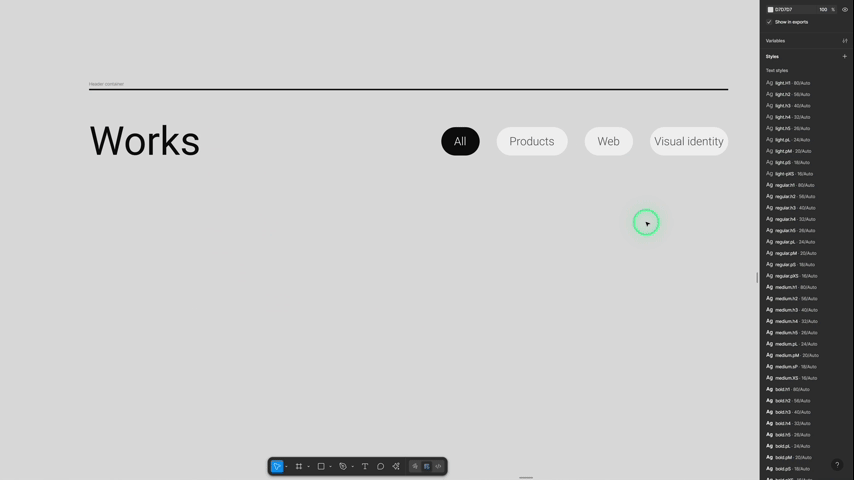
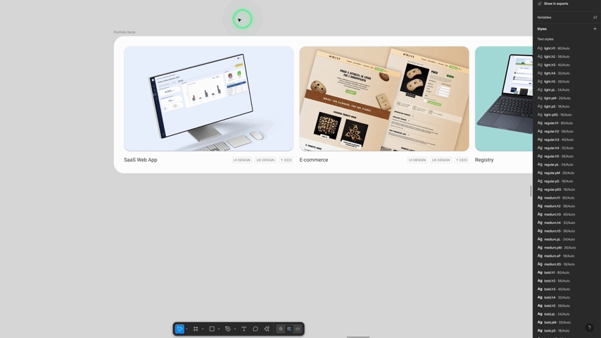
The best way to design using Auto Layout is to first place elements freely, and then start grouping them with Shift + A, beginning from the innermost groups. Auto layout is extremely useful if you want to maintain the same spacing between objects and align them automatically.
Digital devices (especially websites) are built with a block-based logic, where blocks contain other blocks. Thanks to Figma’s Auto Layout, this logic also applies to design, making development easier. You can read my article on Atomic Design to dive deeper into this topic.
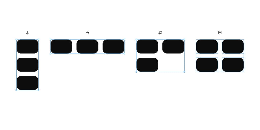
Once you’ve created an Auto Layout, you can choose between different types, each with its own purpose:
- Freeform
- Vertical
- Horizontal
- Horizontal – Wrap
- Grid
Freeform
Each object inside a Freeform layout gets the property position: absolute and can be moved freely. There are no automatic alignments in this layout.
Every object with this property can also be subject to Constraints: you can define fixed distances from the edges of the parent container or make it scale accordingly, and so on.
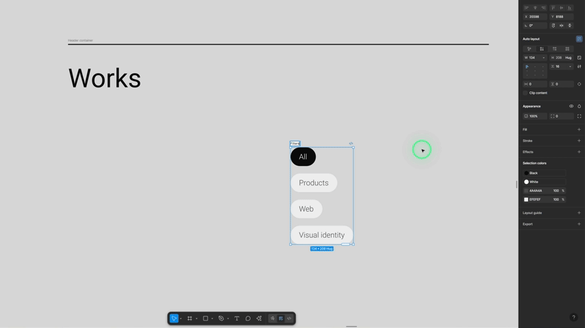
Vertical Auto Layout
This one automatically stacks elements on top of each other. Perfect for lists, menus, or cards where elements should follow a natural vertical flow.
Horizontal Auto Layout
Here, elements line up side by side. Mostly used for navigation bar, icons in a toolbar and so on.
Horizontal Wrap Auto Layout
Wrap takes the horizontal layout and makes it smarter. When there’s no more space in the row, elements automatically wrap onto a new line. It’s ideal for grids of tags, chips, or image thumbnails.
Grid Layout
The grid option creates rows and columns, making it easy to design galleries, dashboards, or even bento-box style layouts. Unlike Wrap, a grid gives you more precise control and flexibility. Figma’s Auto Layout Grid isn’t yet as precise as Framer’s, it still lacks some of the settings needed to make grids fully responsive and flexible. That said, I believe it won’t be long before it catches up.
Adjust spacing properties
Each Auto Layout comes with these properties:
- Padding: the space between the frame’s edge and its content
- Gap between: the space between the objects inside the frame
- Auto: automatically takes up all the available space
For grids:
- fr1, fr2, etc.: here’s an article from Digital Ocean that explains well what these units are and why they’re important to know.
Resizing and Responsiveness
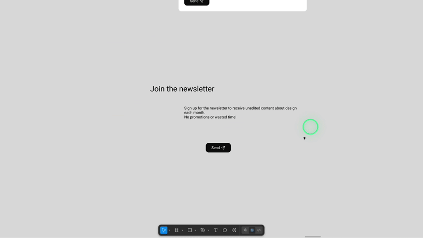
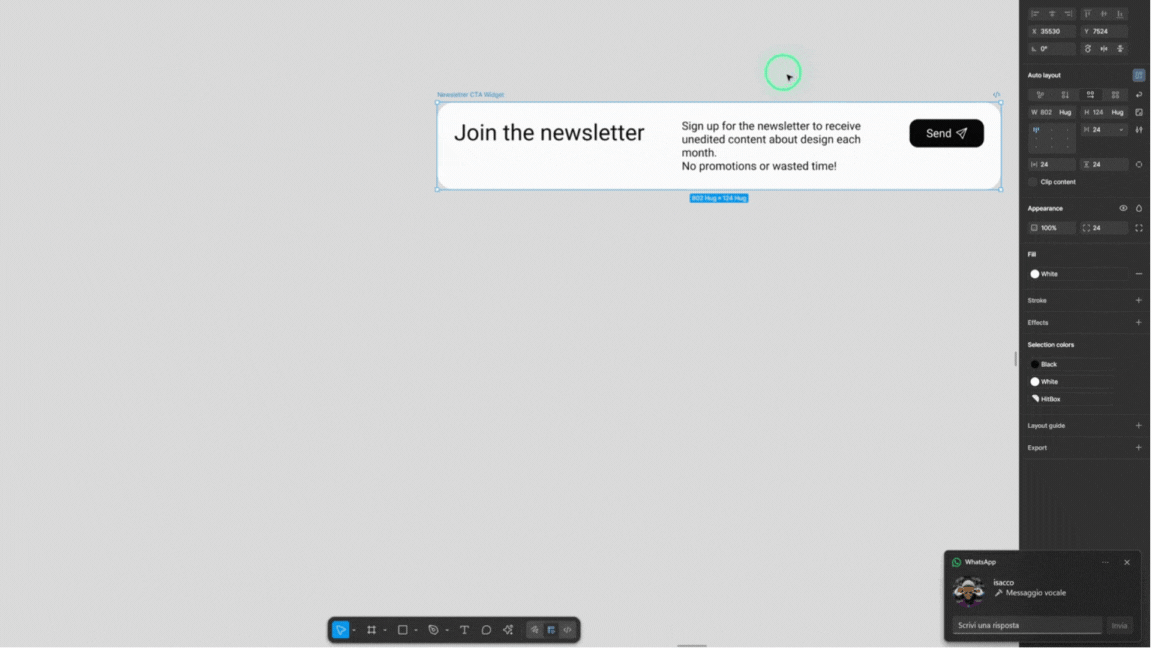
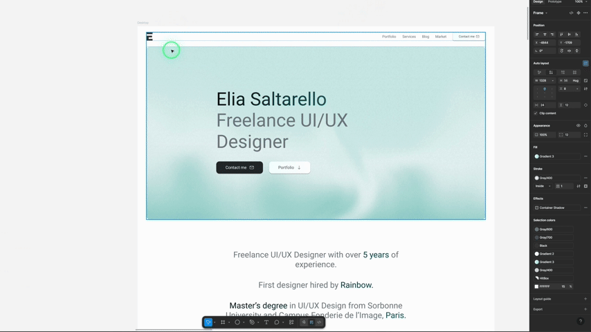
One of the most powerful features of Figma Auto Layout is resizing, which allows elements to dynamically adapt to the size of their container and surrounding content. This enables you to design flexible, reusable components, keeping visual consistency while reducing manual adjustments.
The main resizing options are:
- Hug content → the frame adapts to whatever is inside (great for buttons or labels).
- Fill container → elements expand to fill all available space (perfect for cards or grids).
- Fixed width/height → dimensions stay the same, no matter what. Useful for icons or static elements.
- Min and Max → set limits so an element can resize, but never too much or too little.
Figma Auto Layout Guide Conclusion
If you want to get really comfortable with Auto Layout, my advice is simple: watch a tutorial or two, then practice, practice, practice. Start small with buttons or cards, and soon you’ll be building entire responsive layouts.
Here are two videos I recommend:
To sum up, Figma’s Auto Layout allows you to:
- Speed up your design flow and save time
- Improve the quality and consistency of your designs
- Make life easier for developers with block-based logic
- Build responsive designs that actually scale
Once you’ve experienced designing with Auto Layout, you’ll wonder how you ever worked without it.