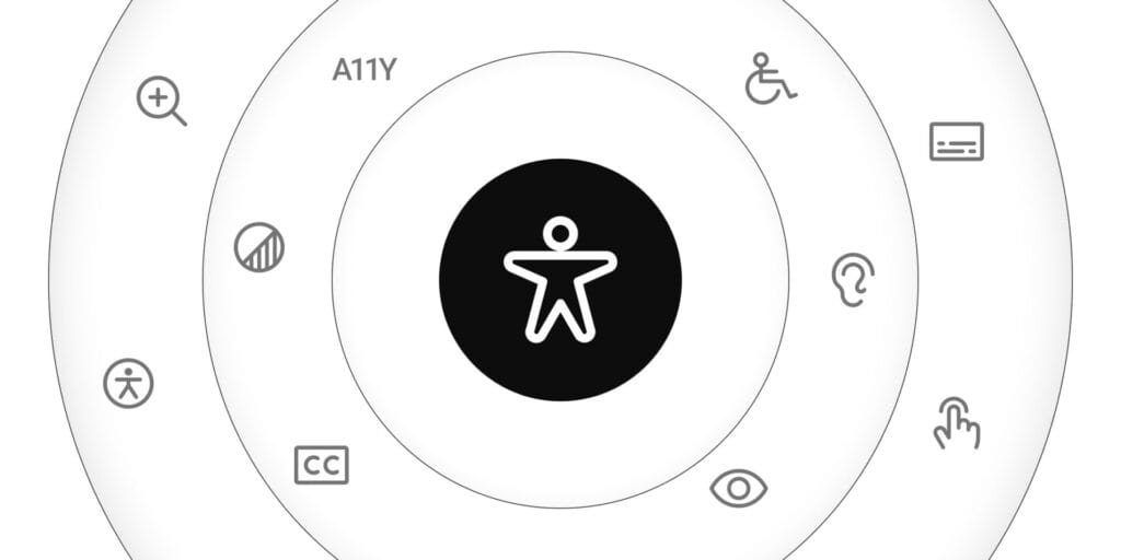

Accessibility is a key part of UX design. Around the world, one in six people lives with or has lived with some form of disability. The role of a UX designer is to create products that exclude as few people as possible (or ideally, no one at all) from using what we design.
Accessibility as a Strength, Not a Burden
Accessibility is often seen by stakeholders as secondary or expensive. It rarely makes it into the roadmap unless the product is specifically aimed at people with disabilities (for example, a website to manage retirement benefits).
In reality, making a digital product more accessible does not require large investments. For example, to improve the accessibility of a website, it is not strictly necessary to add a widget to allow users to change the text size. The most effective approach is to integrate accessibility practices into the design and development process. Doing so creates a higher-quality product that’s naturally usable by more people. For designers, this skill is vital, because accessible design is ultimately consistent, intuitive, and easy to use.
Keeping accessibility in mind also brings extra benefits:
- Improves SEO (for websites)
- Strengthens your brand’s reputation
- Helps you reach and retain more users
- Delivers a smoother experience across different devices
Here are the key principles for creating truly accessible design:
Key Principles of Accessibility in UX Design
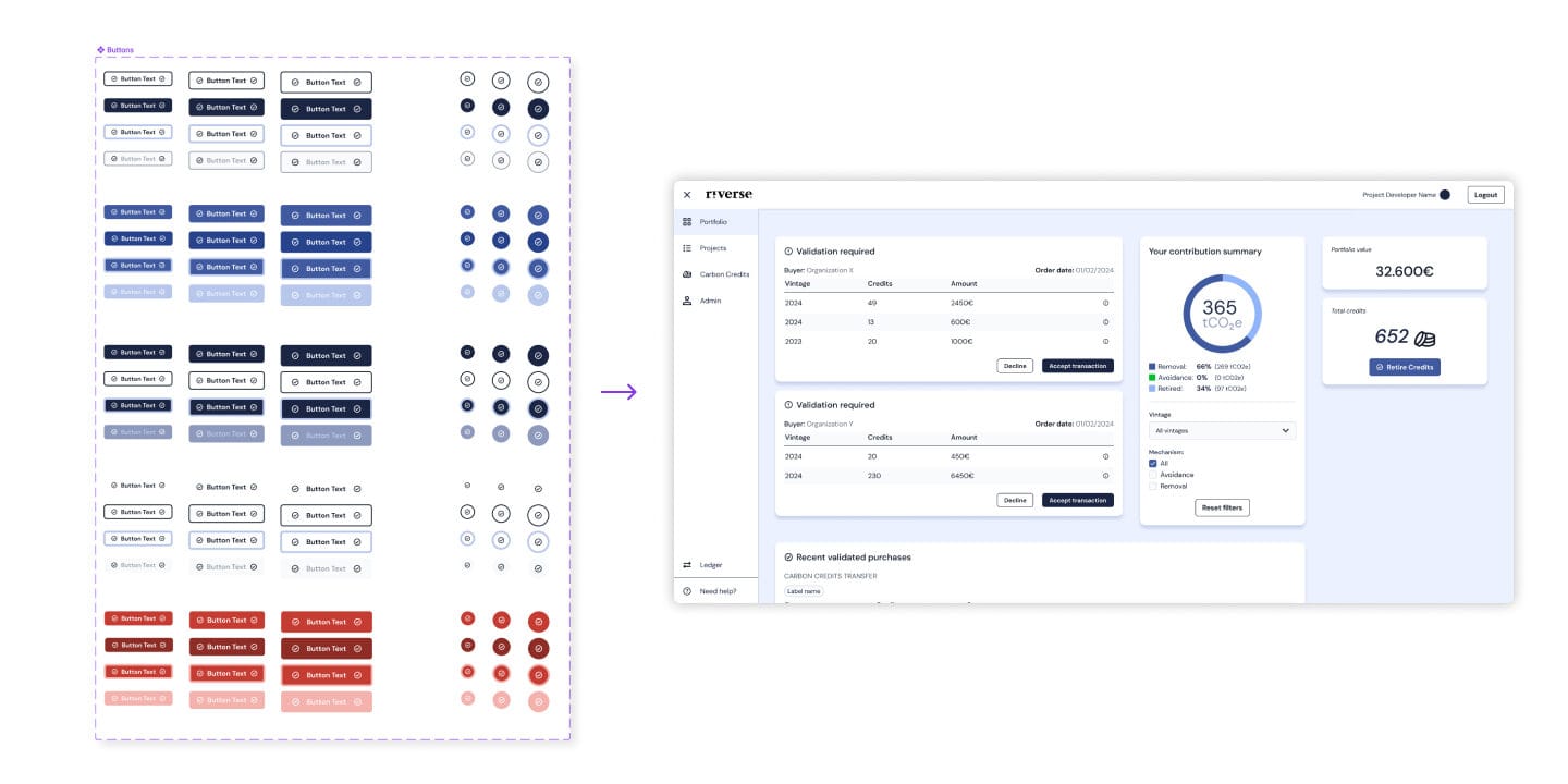
Consistency
Consistency is one of the foundations of accessibility. Every button should share the same visual and behavioral properties: proper size, a uniform style, and clear labeling. For instance, if a confirmation button is called “Submit” on one page, it shouldn’t appear as “Confirm” or “OK” elsewhere. Similarly, states like hover, focus, or click should behave consistently throughout the product. This uniformity makes interfaces easier to navigate and reduces confusion.
The best way to ensure product consistency is by using a Style Guide or a Design System. If you’d like to learn more, I’ve written an article: “Design System in Figma: Why every product needs one“.
Hierarchy
Clear hierarchy is another essential principle. Text, buttons, and headings should follow a logical and consistent order that respects importance. Headings, for example, should always follow the correct semantic sequence (H1 for the main title, H2 for subsections, H3 for smaller sections) so screen readers can interpret the structure correctly. The visual layout should also reflect this hierarchy, highlighting key content while organizing secondary information progressively. A clear hierarchy improves readability and makes the interface more accessible for everyone. Here you can find a well written article from Nielsen Norman Group about Visual Hierarchy.
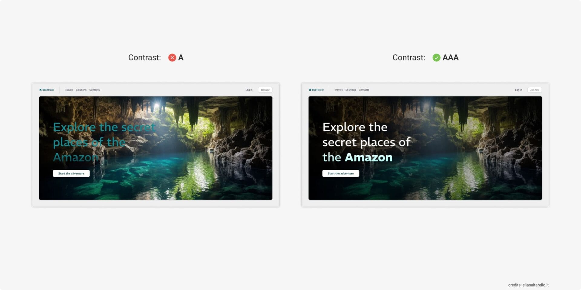
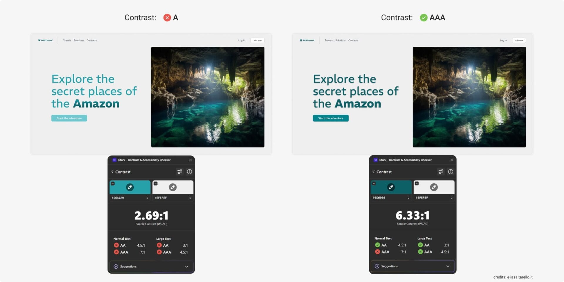
Color Contrast
It may seem obvious, but one of the most common mistakes is poor contrast between text and background. Two typical issues are:
- Text placed over an image background
- Text with insufficient color contrast against its background
To avoid these pitfalls:
- Choose images that are either very dark or very light to ensure strong contrast with text. Adding a subtle shadow effect can further improve readability. The image itself should be relatively uniform and not critical to understanding the content.
- Use a contrast-checking plugin. Always aim for a AAA rating. Anything marked only as “A” is insufficient.
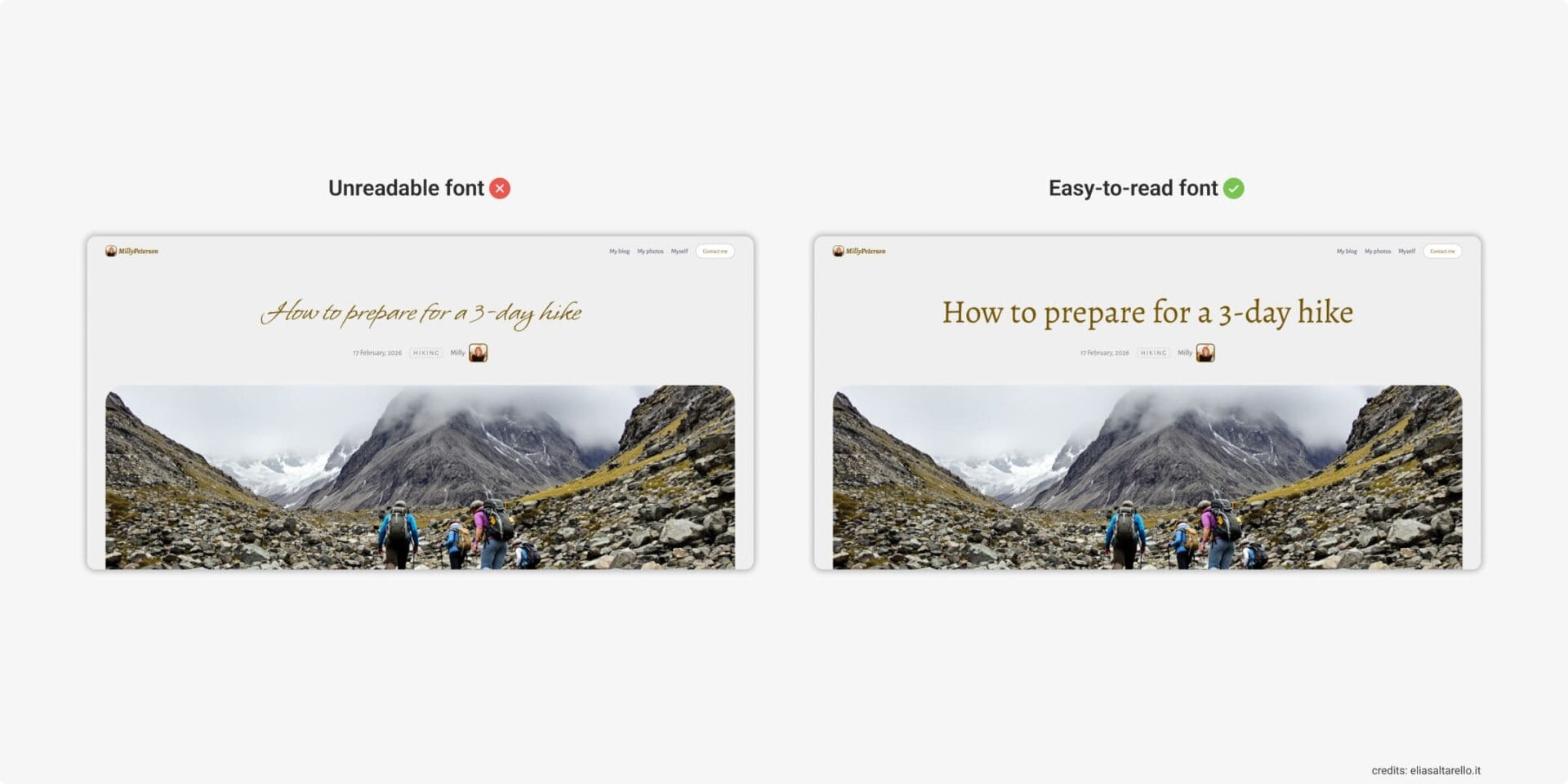
Clear and Legible Typography
Readable fonts are essential for digital interfaces. Even for headings, avoid overly decorative or artistic typefaces.
- Use proper spacing and line height (1.4–1.6).
- Add generous margins and padding to prevent crowded layouts.
- Avoid justified text—great for print, but not for digital. Left-align text (or right-align in RTL languages) to give readers a consistent reference point.
- Never embed text inside images.
Some reliable font choices:
Sans serif (best for screens):
- Roboto
- Open Sans
- Lato
- Montserrat
- Noto Sans
- Source Sans Pro
- Helvetica
- Arial
Serif (good for longer texts):
- Merriweather
- Georgia
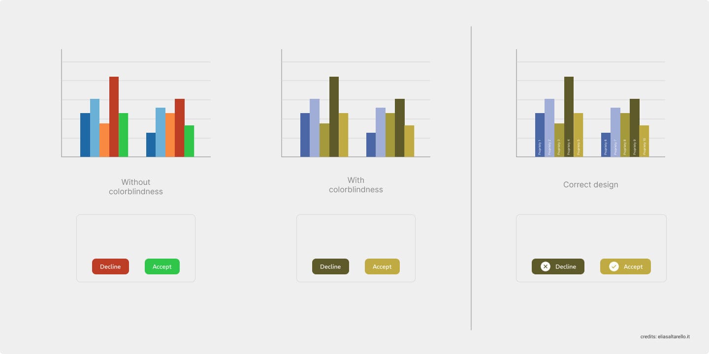
Don’t Rely on Color Alone to Convey Information
Error states, success messages, and alerts should never depend solely on color. Always pair them with icons or clear explanatory text. This ensures information remains understandable for users with color vision deficiencies.
Clear, Clickable, and Comfortable Interactive Elements
According to Google, Apple Human Interface Guidelines, and WCAG regarding Accessibility in UX Design, here are the minimum recommended sizes:
- Text links (desktop & mobile): Must be visually distinguishable, not just by color, but also underline or style changes.
- Buttons (desktop): At least 32–40px tall (closer to 40px is better).
- Buttons (mobile): At least 44px tall (around 7–9mm, the average fingertip size).
- Checkboxes & radio buttons (mobile): Minimum 24×24px tappable area.
- Spacing: At least 8px between interactive elements to avoid misclicks.
- Clickable areas: Where possible, make the entire card or container clickable, not just the text.
Transcripts and Captions for Multimedia
If your product uses audio or video, captions are essential. They don’t just help people with hearing impairments—they also support users who don’t speak the language fluently or those who watch without sound. Providing transcripts ensures inclusivity.
Visible Focus and Keyboard Navigation
Every interactive element should be reachable using the Tab key, activatable with Enter, and dismissible with Esc. The focus state must always be clearly visible so users know exactly where they are while navigating.
Clear Feedback
Users should receive immediate and understandable feedback for their actions—whether it’s an error, a success message, or a loading state. Whenever possible, pair visual notifications with ARIA live announcements, so screen reader users are kept up to date in real time.
Alt-text and aria-hidden
Alt-text
Alternative text describes non-decorative images, making them accessible to screen readers. It’s essential for accessibility and also improves SEO, since it helps search engines understand the image’s content.
Aria-hidden
The aria-hidden="true" attribute hides purely decorative elements (like graphic icons) from screen readers. This prevents distractions and ensures a smoother navigation experience.
Conclusion
Accessibility in UX Design isn’t just about checking compliance boxes. It’s about building digital products that are usable, inclusive, and enjoyable for everyone. By designing with accessibility in mind from the start, you create products that are not only fair and inclusive but also more consistent, intuitive, and effective.
Good accessibility is good design.