
Why the first draft in my Figma AI workflow should be almost free
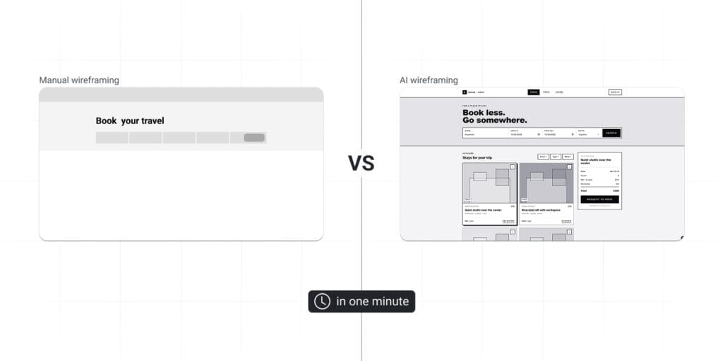
AI lowers the cost of the first test. When a first attempt takes minutes instead of hours, you stop protecting it. You look at it, see what’s wrong and ask the useful question: what is different from what I expected, and how do I improve it?
That question is where the design work happens. A generated wireframe is a hypothesis, and cheap hypotheses are easy to throw away.
My 5-step Figma AI workflow
- Frame the problem before writing the prompt. Who is the user? What task are they trying to complete? What are the constraints: content, brand, device, accessibility?
- Generate many directions. I use First Draft to explore multiple layouts quickly, without getting attached to the first one.
- Critique with explicit criteria. I judge each draft against a checklist (hierarchy, navigation, content flow, consistency, accessibility), not against a vague feeling.
- Rebuild or edit in Figma. Either I start from scratch using the draft as a reference, or I edit directly on top of what was generated.
- Validate with feedback and testing. Only then do I move on to the actual, high-quality design.
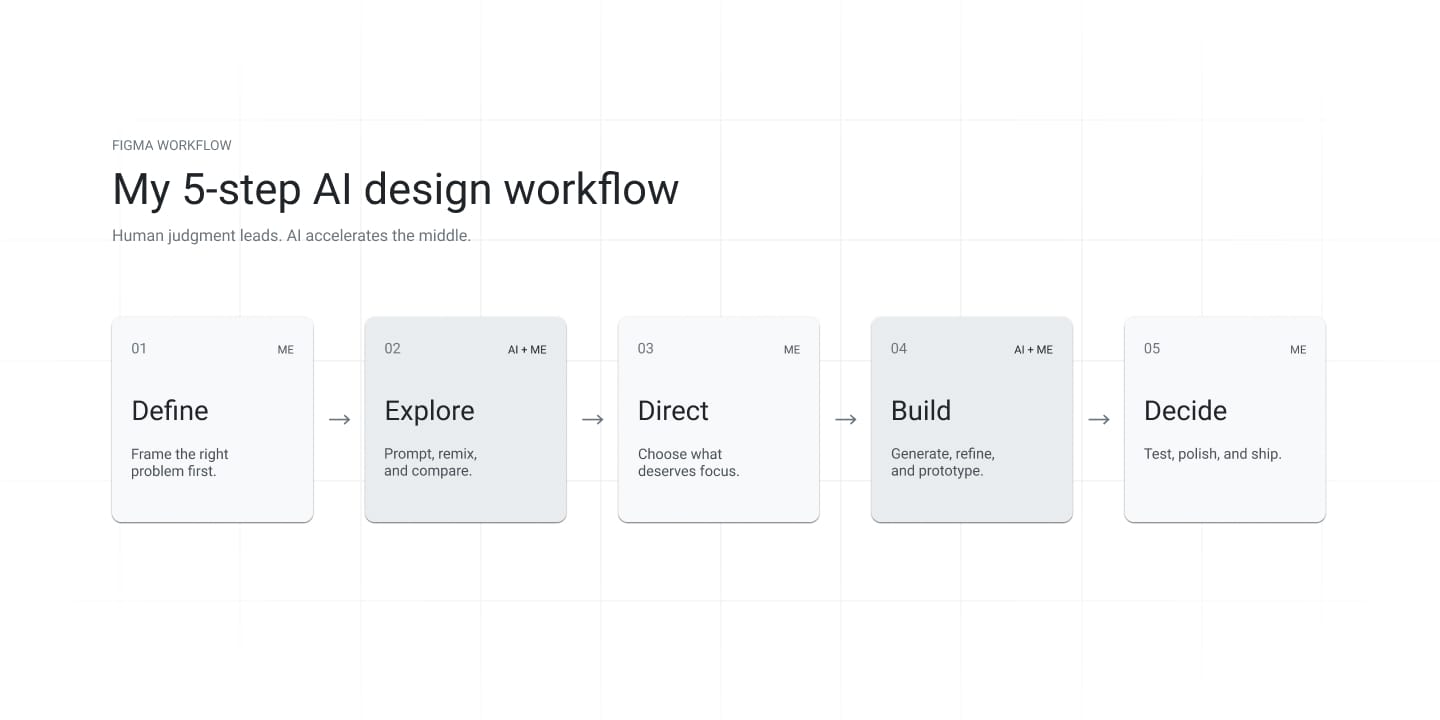
Step 1 is the one AI can’t do for me, and it determines the quality of everything after it.
Case study: EcoStar and my Figma AI workflow
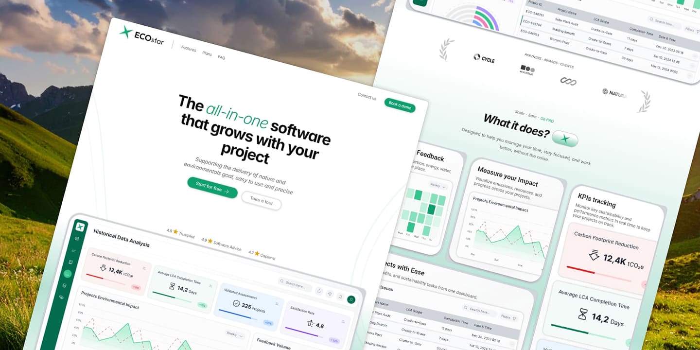
EcoStar is a website I designed for the Framer marketplace. The challenge was to showcase a sustainable, eco-friendly application created by a startup.
The constraints:
- a content-heavy homepage
- mobile-first design
- flexible brand guidelines that allowed fast changes
- a clear message about sustainability
What I asked the AI to do
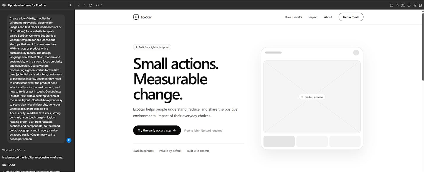
I asked First Draft to generate wireframes for three pages: the homepage, the product page and the contact page. Here is the prompt I used:
Create a low-fidelity, mobile-first wireframe (grayscale, placeholder images and text blocks, no final colors or illustrations) for a website template called EcoStar. Context: EcoStar is a website template for eco-conscious startups that want to showcase their MVP (an app or product with a sustainability focus). The design language should feel clean, modern and sustainable, with a strong focus on clarity and conversion. Users: visitors discovering a green startup for the first time (potential early adopters, customers or partners). In a few seconds they need to understand what the product does, why it matters for the environment, and how to try it or get in touch.
Constraints:
-Mobile-first, with a desktop version of the same layout
-Content-heavy but easy to scan: clear visual hierarchy, generous white space, short text blocks
-Accessibility: readable text sizes, strong contrast, large touch targets, logical reading order
-Built from reusable sections and components, so the brand color, typography and imagery can be swapped easily
-One primary call to action per screen
What I changed, and why
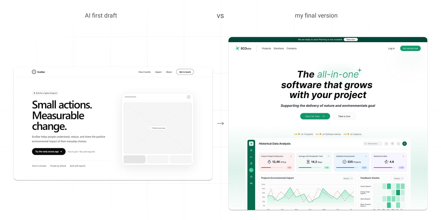
Following my workflow, I critiqued the AI draft instead of accepting it. These are the areas I reworked:
- Hierarchy. On a content-heavy homepage, the sustainability message and the main action have to win the first screen. I adjusted the visual weight so the eye lands there first.
- Navigation. A clear structure matters more than a clever one. I simplified how users move between the homepage, product and contact pages.
- Content flow. I reordered sections so the story builds in a logical sequence, from the problem to the product to the action.
- Consistency with the design system. Generated layouts don’t know your components, spacing or tokens. I aligned everything with the EcoStar brand guidelines so the file stays easy to edit.
- Accessibility. Contrast, text sizes and touch targets are my responsibility. I checked them manually.
Where AI helped in my Figma workflow, and where it didn’t
It helped me with:
- Getting a discussion-ready set of wireframes in about ten minutes, instead of around two hours.
- Comparing layout options I would never have tried on my own.
It didn’t help me with:
- Understanding the user and the business context. That had to come from me.
- Making trade-offs: what to prioritize, what to cut, what the page is really there to do.
- The details that make an interface usable: states, edge cases, real content and accessibility.
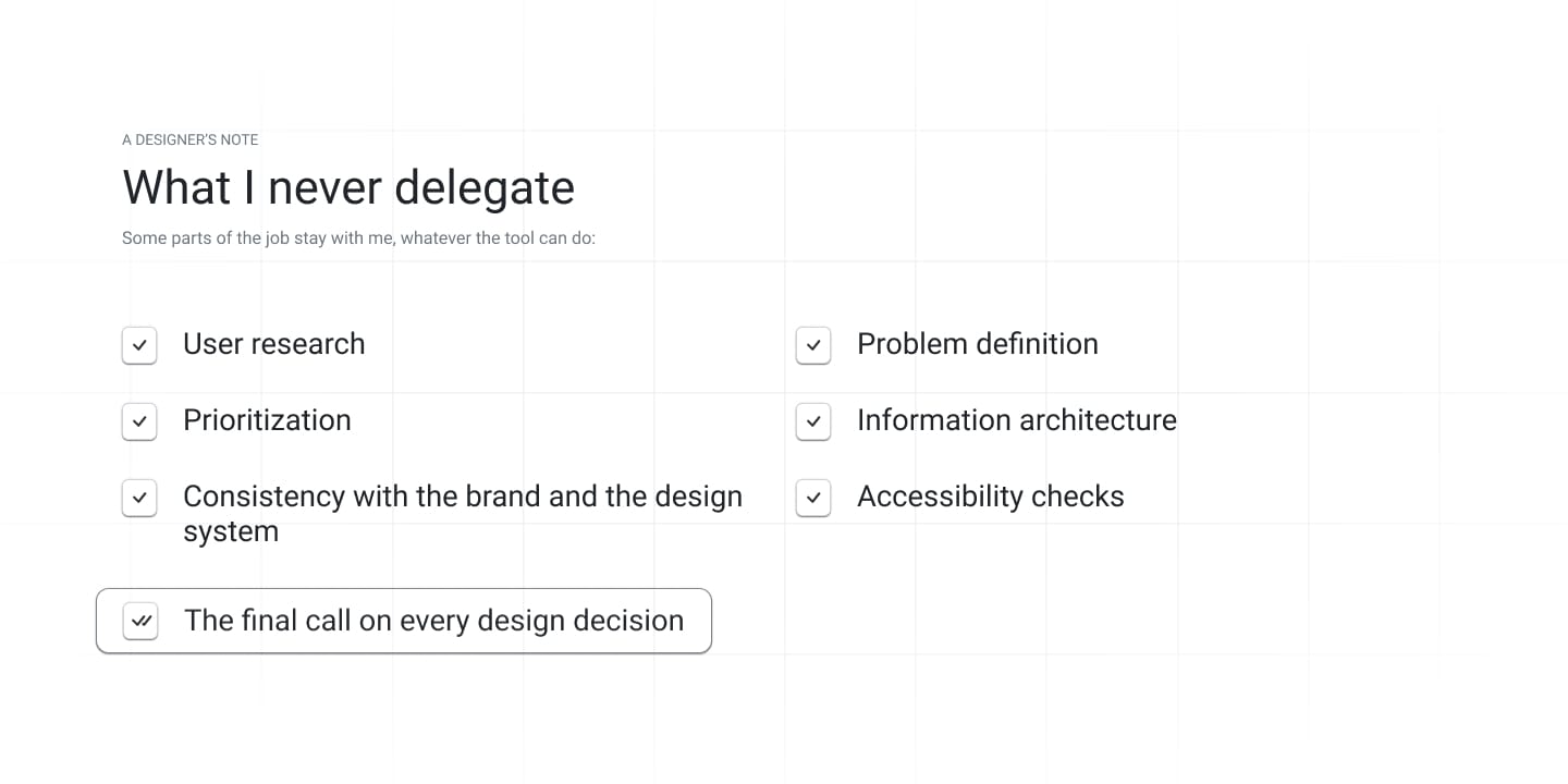
What I never delegate
Some parts of the job stay with me, whatever the tool can do:
- User research
- Problem definition
- Prioritization
- Information architecture
- Accessibility checks
- Consistency with the brand and the design system
- The final call on every design decision
One more habit I recommend: keep sensitive material and client information out of AI tools. Speed is never worth a confidentiality problem.
Conclusion
My Figma AI workflow changed how fast I can start a project. It didn’t change what makes a good design decision, or good design in general: understanding the problem, making choices based on the goal, and being able to explain them.
The tool gave me a draft. The judgment and the responsibility stay with me.
Want to see my process in action?
If you’re hiring a product designer, you can see how I work through the projects themselves. Take a look at the EcoStar case study or get in touch.