
A design system is a library of components, rules, and visual styles supported by clear documentation. While it may require some initial time investment to create, it is an essential tool for building and maintaining a high-quality product—whether you’re working solo or as part of a large team.
In this article, we’ll explore why every digital product should have a design system, how it fosters collaboration, ensures consistency, and reduces maintenance efforts, especially when implemented with tools like Figma.
What is a Design System?
A design system is a collection of reusable components, design principles, and clear guidelines that form a shared language between designers and developers—and among designers themselves.
It evolves alongside the product and acts as a living documentation of its design. In Figma, this often takes the form of a structured file or library that centralizes styles, tokens, and components used throughout the interface.
What’s the difference between a Design System and a Style Guide?
A style guide includes static design rules like color palettes, fonts, and visual patterns. A design system, on the other hand, is much broader and includes ready-to-use components (e.g., buttons, cards, modals) with clear documentation on how to implement and modify them. It’s modular, interactive, and scalable—making it far more powerful than a static style guide.
Why Is a Design System important?
Design systems provide tangible benefits that impact the entire product lifecycle. Here’s why your product needs one:
- Ensures consistent sizing and spacing
- Guarantees visual and stylistic consistency
- Speeds up design updates and product maintenance
- Facilitates team collaboration and communication
Let’s explore these in more detail.
Consistent sizing and spacing
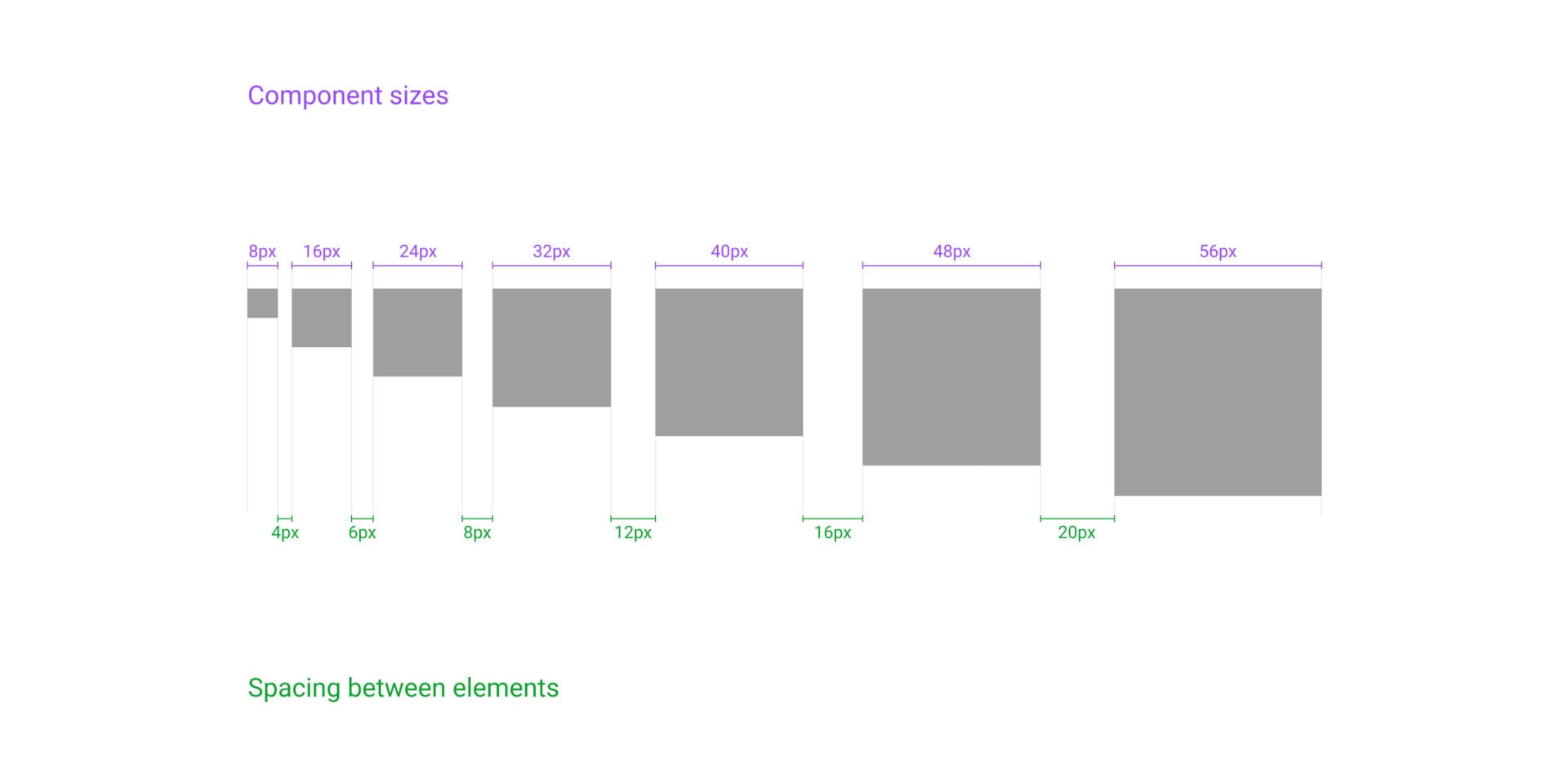
By defining spacing and sizing as variables in Figma, designers can apply consistent measurements across all screens. This reduces discrepancies and simplifies handoff to developers.
A common approach is to use increments of 8px:
32pxheight for standard buttons40pxheight for larger buttons
You might also use multiples of 6px for grid spacing:
- 6, 12, 18, 24, 30…
Visual and stylistic consistency
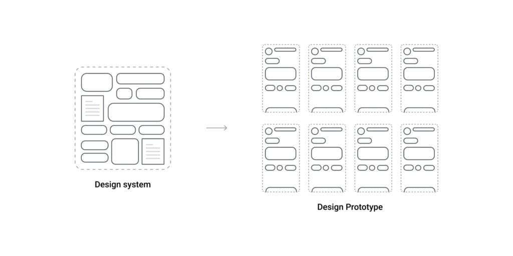
Reusing components ensures that every new screen or page maintains the visual identity and design standards of the product. To make this possible without limiting creativity, it’s crucial to:
- Follow Atomic Design principles
- Leverage Auto Layout in Figma
- Create flexible, variant-rich components
If components are too rigid or lack proper variants, they can become bottlenecks during iteration. For example, in a UI for managing hotel rooms, each module should be modular and adaptable depending on what content is required.

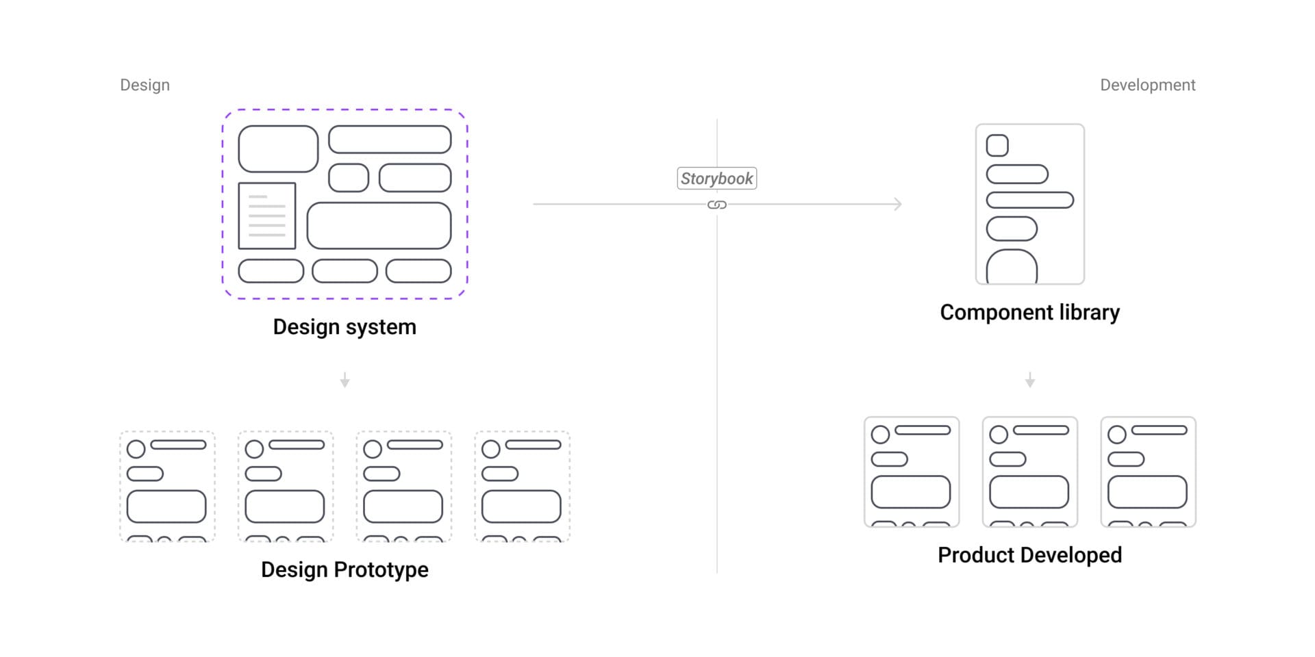
Easier maintenance of a Design System in Figma
One of the most powerful benefits of design systems in Figma is single-source updates. Modify a parent component, and the changes cascade across all instances.
This approach saves hours during updates. For instance, while working on two platforms (MRV and Registry) at Riverse, I often received stakeholder requests for UI changes. Thanks to the design system, I only needed to update a component once to reflect the change across dozens of screens.
For example:
- Updating a header component once instead of 15 times
- Modifying an accordion component once instead of 30 instances
This efficiency also extends to developers. At Riverse, we connected Storybook to our design system, ensuring real-time design updates were immediately available to the dev team.
Better team collaboration
Design systems significantly improve collaboration by serving as a single source of truth for the entire team. Whether designers are co-editing the same file or developers are referencing components in Storybook, a shared system reduces misunderstandings, avoids duplicated effort, and ensures consistency across the product.
A personal example:
While working on an educational platform for Sorbonne Université, our team relied on a shared design system in Figma. It enabled us to collaborate in real-time without overwriting each other’s work or introducing inconsistencies. Before diving into the design, we established a clear methodology based on the principles we were learning in our UI/UX master’s course — this foundation made all the difference in aligning our work.
Speaking a common language with developers
You don’t need to be a developer to design effectively — but understanding how developers think and work can significantly improve your impact as a designer.
A well-documented design system bridges the gap between design and development by using shared terminology and logic, such as:
- Tokens
- Variables
- Components
- Layout grids
- Breakpoints
To strengthen this alignment, UI designers should also familiarize themselves with the basics of the frameworks their development team uses. Some of the most common include:
While working at Riverse, I realized how valuable my knowledge of HTML and CSS was. It helped me better understand developer needs, communicate more clearly, and build design systems that were easier to implement. Exploring the frameworks used by our dev team also improved the consistency and scalability of the system we created.
The result? Smoother handoffs, fewer misunderstandings, and stronger collaboration between design and development.
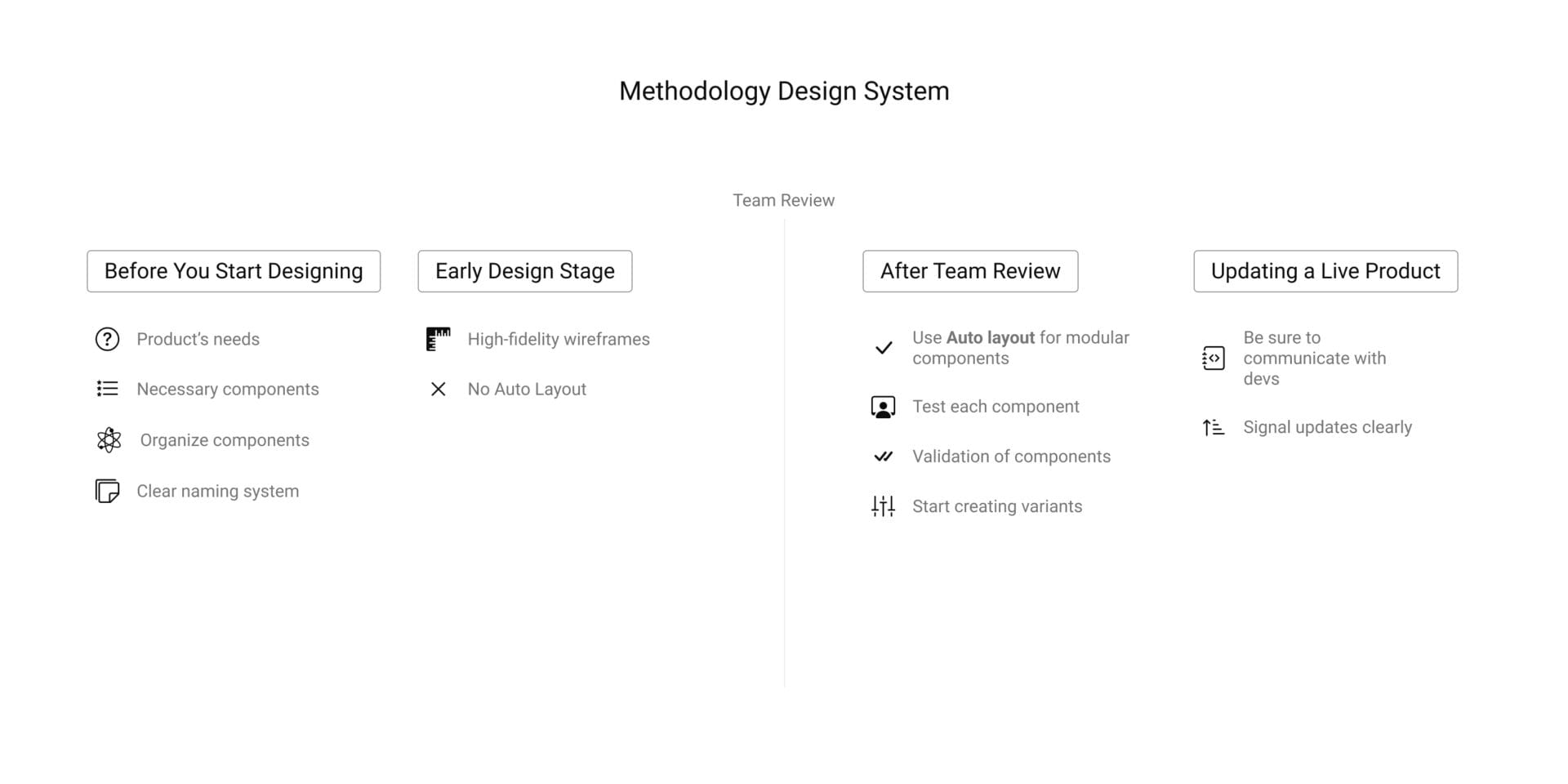
How to build a Design System in Figma: Methodology
Every designer or team has their own approach, but here’s a process I’ve found effective:
Before you start designing
- Identify the product’s needs
- List the necessary components
- Organize components hierarchically (Atomic Design)
- Create a clear naming system for all variables and components
Early design stage
- Start with high-fidelity wireframes before building components
- Avoid using Auto Layout at this stage to keep layout exploration flexible
After team review
- Apply Auto Layout to create modular components
- Test each component in multiple contexts
- Only after validation, start creating variants and implement them across pages
Updating a live product
If you can’t connect your design system to Storybook or a dev-friendly documentation tool:
- Make changes carefully and communicate clearly with devs
- Ask developers how they prefer to receive updates
What if you’re the only designer?
Even if you’re working solo, a design system is critical:
- It ensures clarity for future collaborators (like developers or new designers)
- Reduces errors by keeping your design decisions consistent
- Saves time during future iterations or pivots
- Prepares the product for scaling to a larger team
Being the only designer means even more responsibility in documenting your work well. Renaming components, organizing libraries, and structuring files clearly will save you from chaos in the long run.
Conclusion
A design system is more than just a nice-to-have—it’s a strategic asset. It improves team communication, guarantees design consistency, reduces rework, and scales your product efficiently.
Whether you’re working with a large team or flying solo, building a design system in Figma will help you design better, faster, and more collaboratively. Start small, iterate often, and always keep communication with your team (or future self) at the core of your system.