
Wireframes are one of the most widely used tools in UX design. They help define the structure of a digital product before diving into visual details, making it easier to focus on core functionality, layout logic, and content hierarchy.
Whether you’re designing a new feature or rethinking an existing interface, wireframes provide a flexible way to explore ideas, iterate quickly, and align your team around shared decisions. When used correctly, wireframes can save time and money, so it’s important to understand how and when to use them.
What Are Wireframes in UX Design?
Wireframing is a UX method that helps designers create a rough layout of the product without getting distracted or slowed down by visual decisions, so it’s especially useful during iterative feedback with the team. Wireframes are usually built using grayscale and simple neutral shapes, but there are also styles that use colored sticky notes (physical wireframes) or pre-built components.
In this phase, the team should engage in a strong feedback loop to move the product closer to its best possible form, one defined and refined during previous UX research stages. You can find a list of all the UX methods I use in this article: UX Methods: What I Use and When.
Why Use Wireframes?
Wireframes are a key tool to guide the prototype design toward the most effective version, based on insights gathered during UX research. Using them during the design process helps explore options, focus on what truly matters, and optimize both time and resources.
Here are the main reasons you should include wireframes in your workflow:
- Efficient exploration of new design ideas
- Focus on key product features
- Fast, feedback-driven iterations
- Saving time and money
1. Efficient exploration of new design ideas
Need to add a new feature to your platform? Should it be presented through a multi-step process or all at once? How should the dashboard be structured? How much space should a specific widget take up?
These are common questions during interface design. If tackled too early with a fully styled design (colors, fonts, images), they can slow things down. It’s easy to waste time adjusting margins or visual details before confirming the overall structure.
Wireframes, on the other hand, focus on information architecture, visual hierarchy and functionality. You can compare different layouts quickly and identify the most effective one, without being distracted by the final look.
2. Focus on key product features
Wireframes force you to think in essentials. They help you ask: What’s the main goal of this page? What’s the primary action I want the user to take? Without visual styling influencing the design, it’s easier to map out where features go, decide what’s really necessary, and remove or postpone secondary elements.
This is especially valuable in complex projects or feature-rich digital platforms, where clarity is everything, like in the redesign I worked on for the Green Project Showcase on the Registry.
3. Fast, feedback-driven iterations
One of the biggest strengths of wireframes is how well they support quick iteration cycles. With a sketch or low-fidelity digital draft, you can gather feedback early and before investing heavily in visuals or development. Visual design feedback can come later, once the structure is validated.
A typical iteration loop might look like this:
IDEATION → CREATION → [FEEDBACK → REVISION] → LOOP[] → APPROVAL
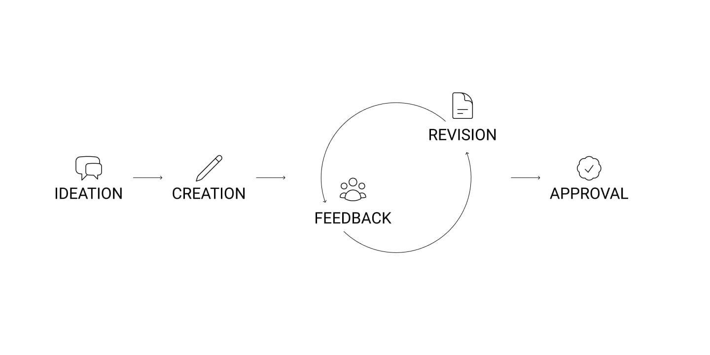
This process makes it easier to collaborate with stakeholders, users, and team members; saving time and keeping the focus on the product’s core goals.
4. Saving time and money
Starting directly with high-fidelity design can lead to wasted time and budget: expensive revisions, late changes, or development work that has to be redone. Wireframes, instead, are light and flexible. They let you validate structure and content early, reducing the risk of costly mistakes later in the process.
This is where Design Debt often begins: the accumulation of rushed decisions, inconsistencies, or UX flaws that end up costing more than doing things properly from the start. If you’re curious to learn more, this article of Design Debt 101 explains design debt in more detail, with examples and practical advice on how to avoid it. I already have plans for an article on design debt coming in the next few months.
When to Use (or Not Use) Wireframes in UX Design
Like all UX tools, wireframes should be used mindfully. Most of the time, they’re a smart choice, but that doesn’t mean they’re always necessary.
Sometimes, skipping wireframes is the more efficient option, especially when the design is already well-defined or you’re working on small changes.
When to Use Wireframes
Wireframes are particularly useful during key phases of the design process, where clarity, speed, and collaboration matter:
- At the beginning of a project or for exploring new features
- To align on structure and logic before visuals or code
- For early usability testing (focusing on flow and clarity)
- With time or budget constraints and a complex project
- To define content hierarchy and position of key actions
When to Avoid Wireframes
Wireframes aren’t always needed, they can slow things down or add unnecessary steps in certain situations:
- For high-impact visual presentations (e.g., for a non-technical client)
- For small tweaks or content updates
- When a well-established design system is in place and layouts can be built directly
Common Types of Wireframes in UX Design
Not all wireframes are the same: they vary in purpose, fidelity, and the tools used to create them. Choosing the right one depends on what stage the project is in and what kind of feedback you need.
Here are the three most common types:
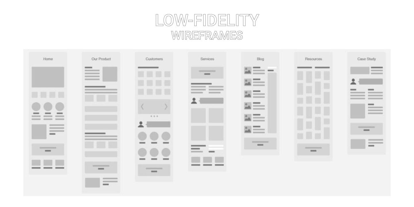
Wireframes low fidelity (lo-fi)
Lo-fi wireframes are quick, simple, and minimal. They help you explore ideas, define basic layouts, and work through structure and flow without visual distractions.
They’re usually made of lines, boxes, text placeholders, and short notes. You can draw them on paper, whiteboards, or use lightweight digital tools
Best for:
- Early project phases
- Brainstorming or design sprints
- Quick feedback and fast iteration
- Defining overall structure
Pros:
- Fast to create and easy to change
- Keeps focus on content positioning and logic
- Great for team collaboration
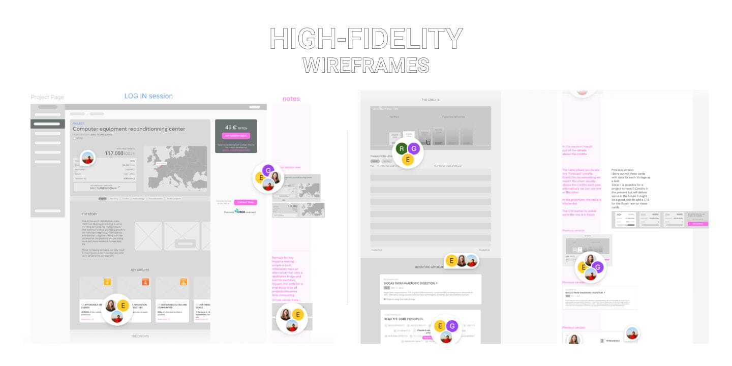
High-fidelity wireframes (hi-fi)
Hi-fi wireframes are more detailed and closer to the final design, but still keep things visually neutral. They include real text, defined spacing, consistent layout, and sometimes basic interactions.
You can build them using tools like Figma or Adobe XD.
Best for:
- When the structure is validated and you need more precision
- Before moving into full visual design
- Testing with users or stakeholders
- Sharing detailed layouts with developers
Pros:
- Clear overview of content and layout
- Makes the transition to UI design easier
- Useful for realistic user testing
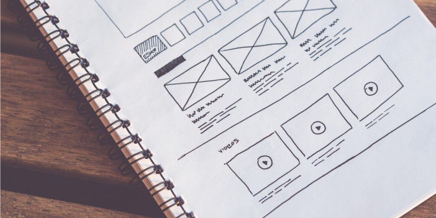
Physical wireframes
Sometimes the fastest way to start is on paper. Physical wireframes are hand-drawn drafts made on notebooks, sticky notes, or whiteboards. They’re perfect for quick collaboration and idea sharing.
Best for:
- In-person workshops
- Fast brainstorming
- Informal discussions in small teams
Pros:
- Extremely fast and easy to iterate
- Encourages creativity and discussion
- No need for digital tools or setup
Best tools for wireframing
There are lots of tools out there to build wireframes. Some are better for quick sketches, others for complex prototypes. Choose based on your workflow and team.
Figma
A versatile, cloud-based tool for both low and high-fidelity wireframes. Great for real-time collaboration and seamless transition to full UI design. Figma.com
Pros: Live collaboration, free for small teams
Cons: Less immediate for quick sketches
Balsamiq
Perfect for lo-fi wireframes. Its “hand-drawn” look keeps the focus on structure over visuals. And I love the name! balsamiq.com
Pros: Super fast and simple
Cons: Not suitable for detailed or interactive prototypes
Adobe XD
All-in-one tool for UI design and prototyping. Good for integrating wireframes and visual design in one workflow. adobexdplatform.com
Pros: Great for advanced prototypes
Cons: Less community-driven than Figma
Sketch
I actually used it very little, a long-time favorite for UI designers (Mac only). Works well for wireframes and integrates with design systems and plugins. sketch.com
Pros: Clean interface, modular
Cons: Mac-only
Miro
Not a UI design tool per se, but excellent for mapping logic, flows, and rough wireframes. Great for brainstorming and team workshops. miro.com
Pros: Ideal for structure, flows, and collaborative thinking
Cons: Not suited for precise layout or clickable prototypes