
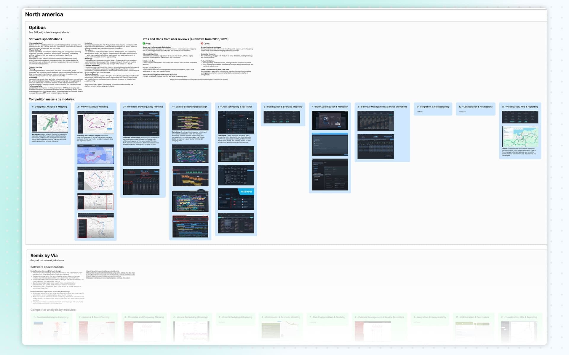
Benchmark
I conducted a competitive benchmark of existing transit planning web apps in North America. The analysis covered platforms like Optibus, Remix, Trapeze Group, Giro, Ecolane and several others. I compared features, interaction models, navigation patterns and visualization techniques.
This allowed us to identify gaps in the market and highlight opportunities where the new platform could offer superior functionality or workflow improvements.
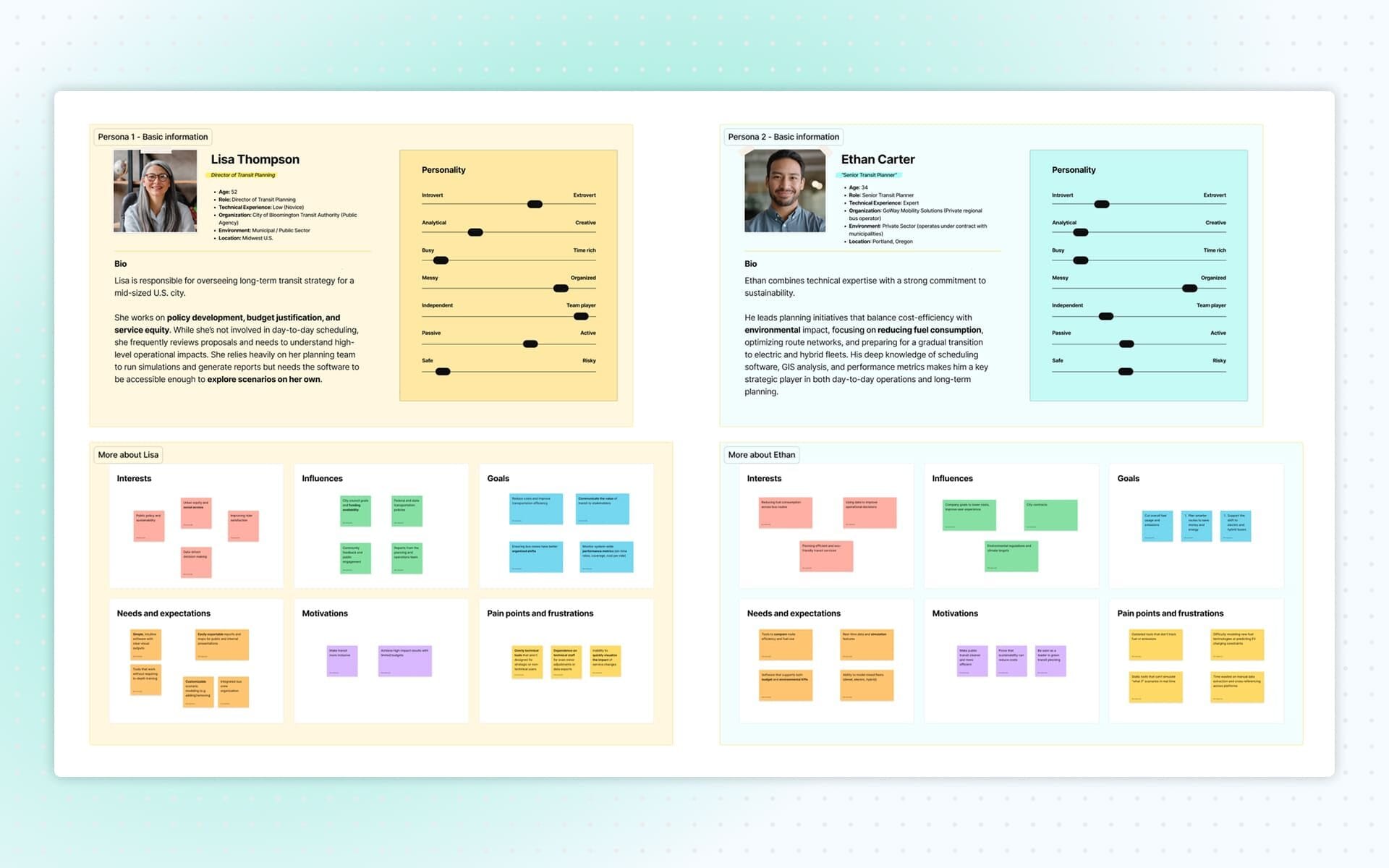
UX Personas
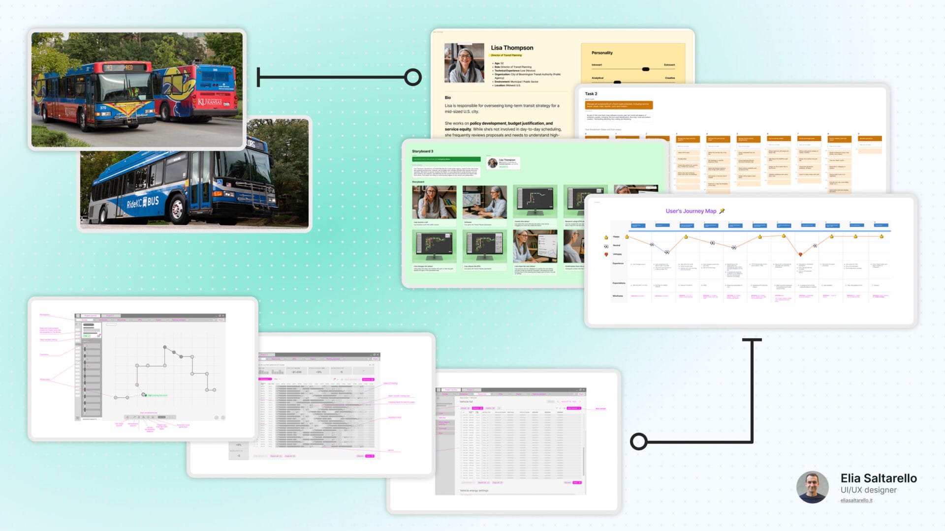
To gather direct insights, I created two initial personas and used them to craft targeted questions for transit planners on LinkedIn. After receiving some responses, I synthesized the insights into two detailed personas based on real profiles, motivations and responsibilities. These personas guided all subsequent research activities and helped maintain user-centered decision-making.
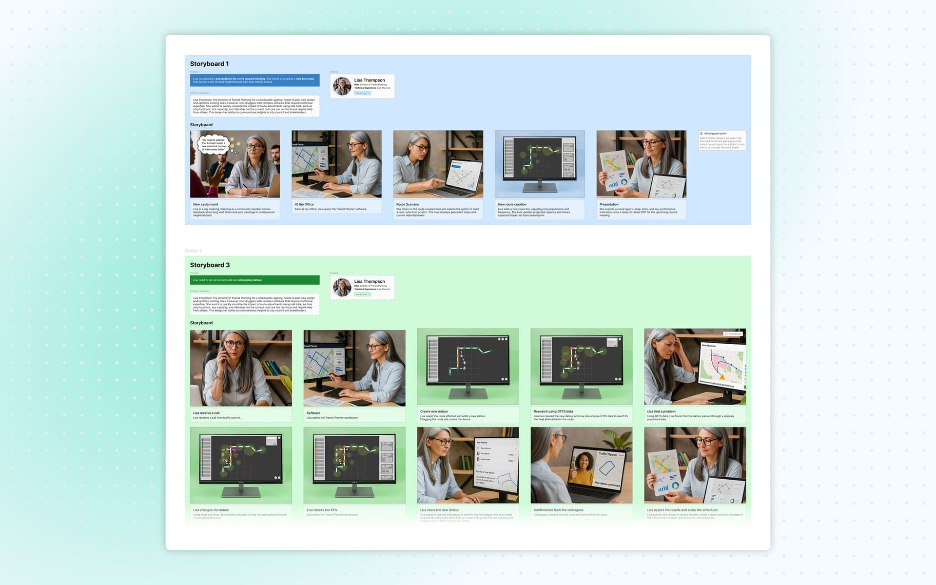
Storyboard
I then developed a storyboard that illustrated how each persona interacts with transit planning tools in real contexts. The storyboard highlighted motivations, tasks, frustrations and external constraints. It helped visualize user scenarios clearly and supported the identification of opportunities and pain points the application should address.
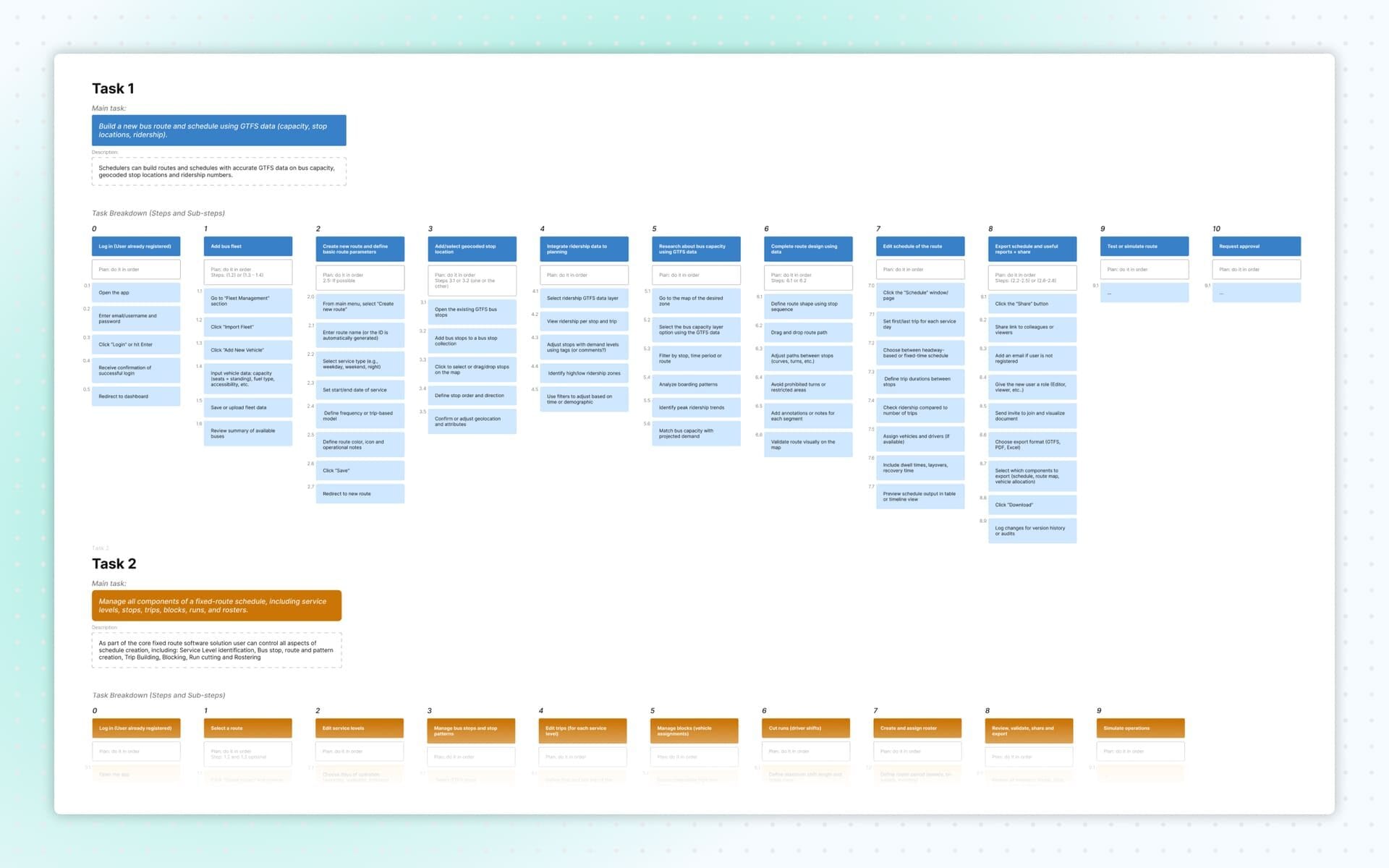
Task Analysis
I created a task analysis to break down user goals, the steps needed to accomplish them, and the personal, social and cultural experiences users bring to their workflow. I analyzed three core tasks:
- Creating a new bus route and schedule using GTFS data, capacity constraints, layover positions and driving time.
- Managing route components and scheduling for fixed routes, including service levels, stops, trips, blocks, runs and rosters.
- Configuring and activating emergency detours without duplicating existing scheduled data.
This work clarified the operational complexity of the environment and the range of features the product needed to support.
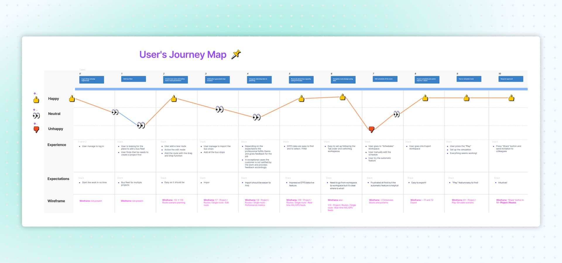
User Journey Map
I created a user journey map to identify pain points and opportunities for improvement throughout key workflows. This mapping helped pinpoint friction points, information gaps, and areas where the interface could streamline planning and scheduling tasks.
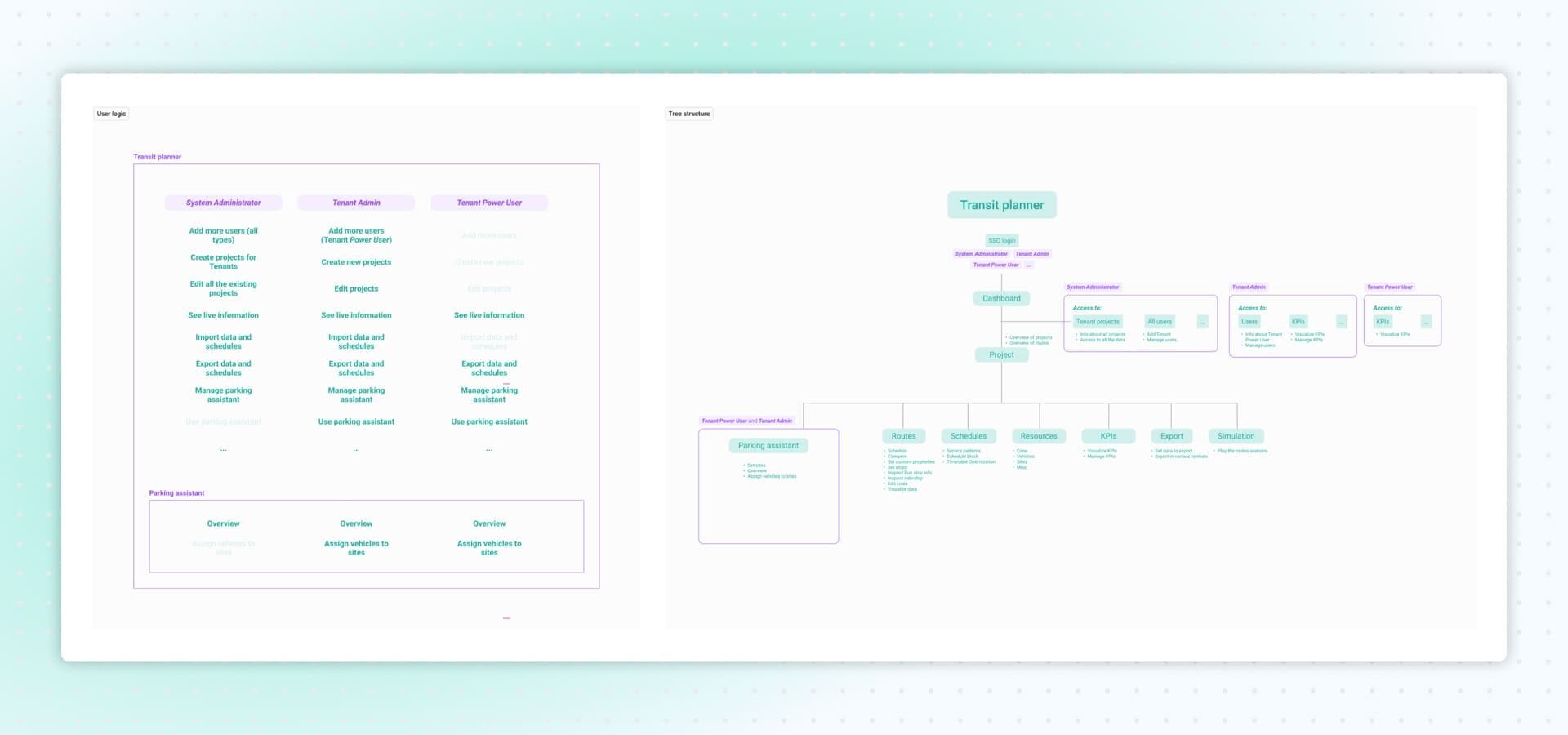
User Logic and Tree Structure
I defined the user logic based on three key user types:
- System Administrator
- Tenant Admin
- Tenant Power User
Each role had different permissions, such as managing users, creating or editing tenant projects, importing/exporting schedules, accessing real-time information, and using the parking assistant.
Using this logic, I created a low-fidelity structural map of the application.
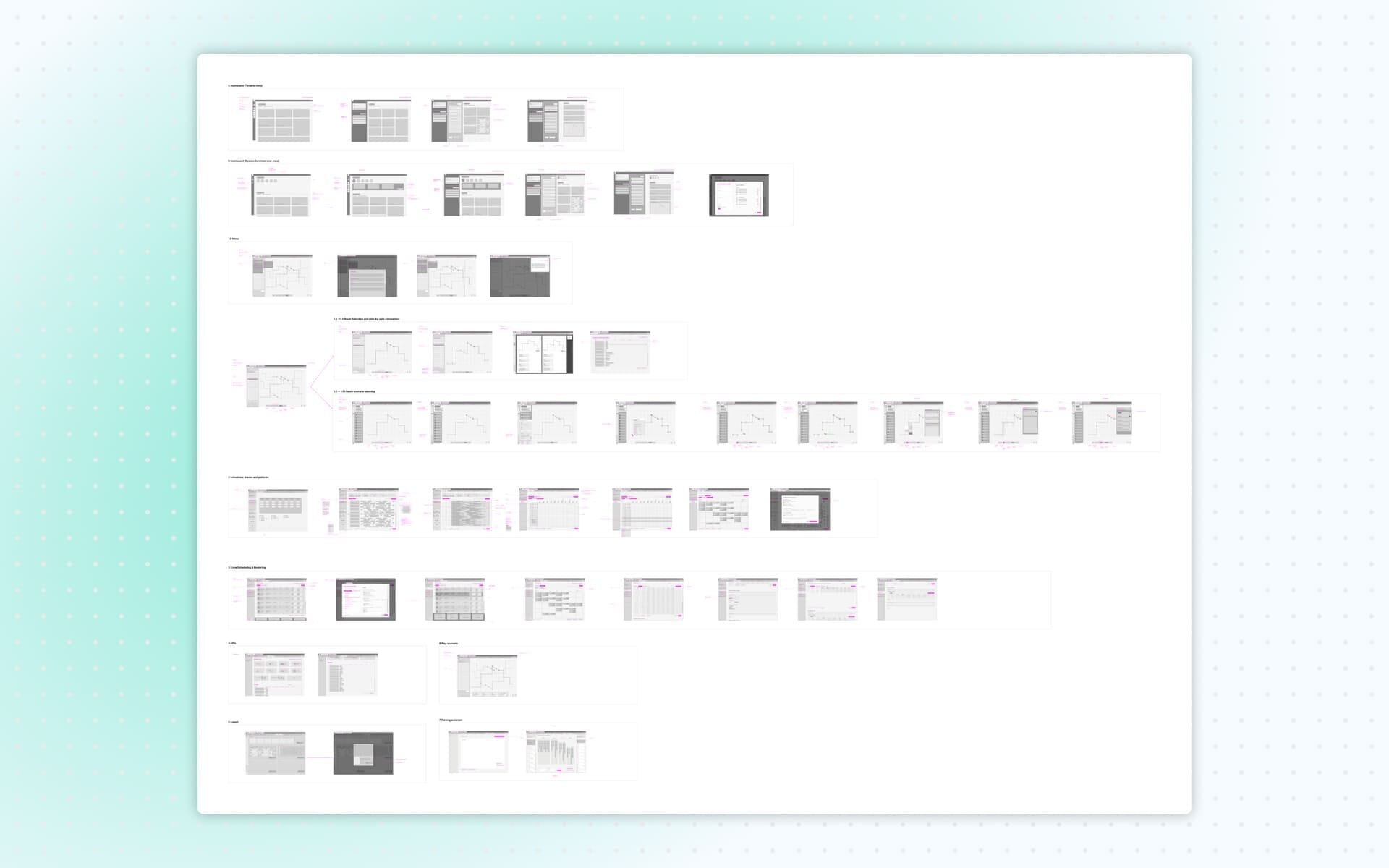
Low-Fidelity Wireframes
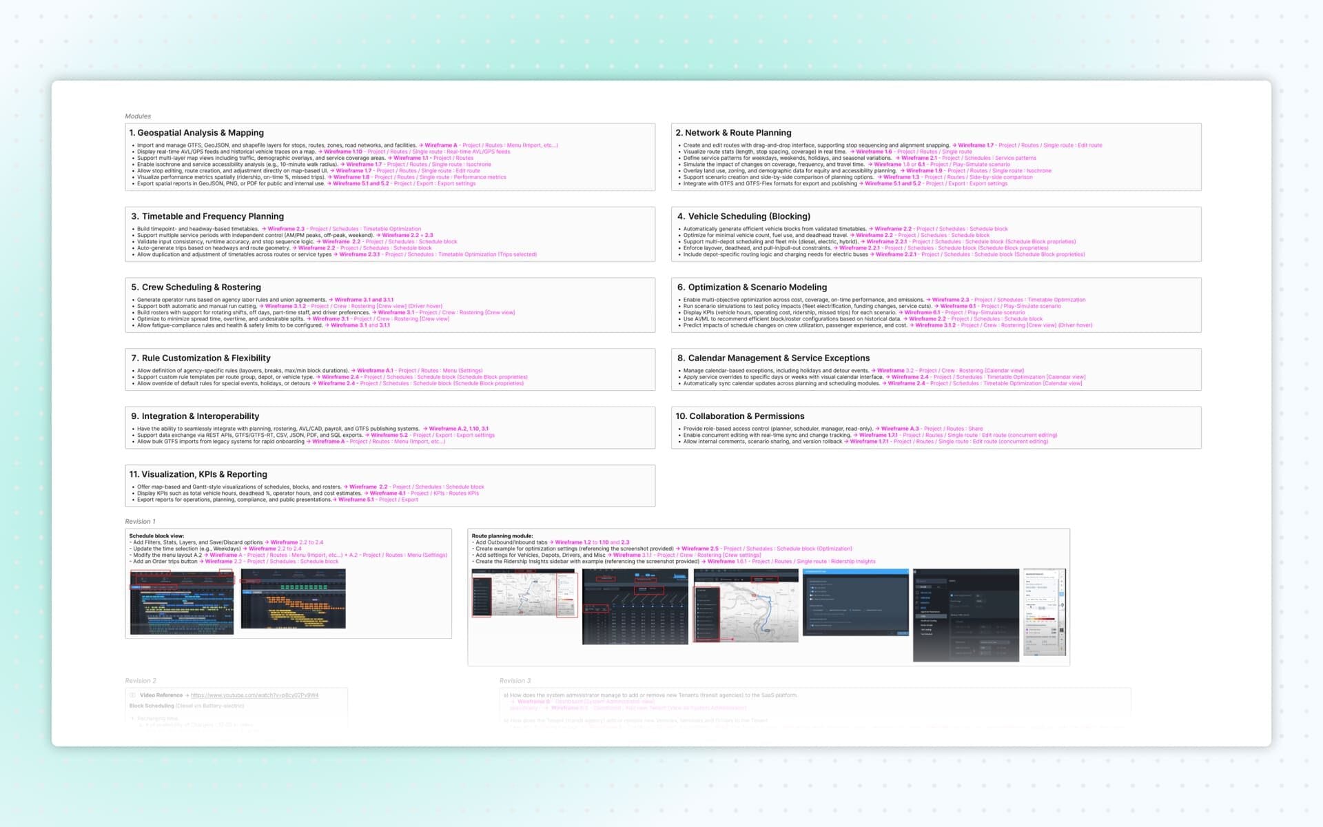
Module Overview and Wireframe Index
I first created a complete index of all modules requested by the client. For each module, I documented where every feature or requirement would be represented in the wireframes. This index became an essential reference for both the client and the internal review process, ensuring every request was addressed.
During each revision phase, I also highlighted precisely where updates were made in the wireframes, noting the specific screen and the reasoning behind each change.
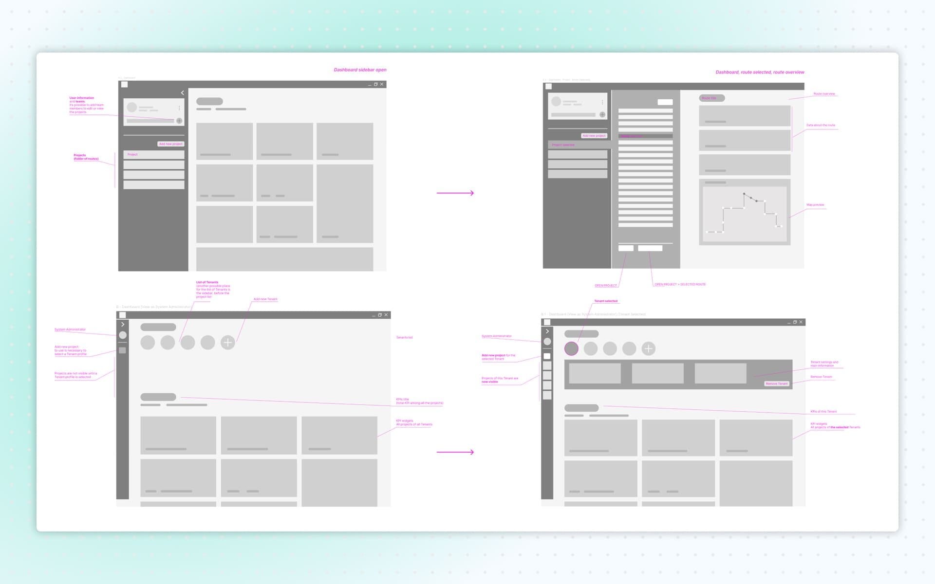
Wireframes: Dashboard
I began by designing the dashboard screens. Multiple dashboard views were needed to reflect the different permissions across user types. For example, Tenant Power Users could not create or edit projects or add new users, while Admins could.
The dashboard offered an overview of existing projects, each with a quick preview of routes, map snippets and stop information. The goal was to give users immediate situational awareness without needing to navigate deeply into the system.
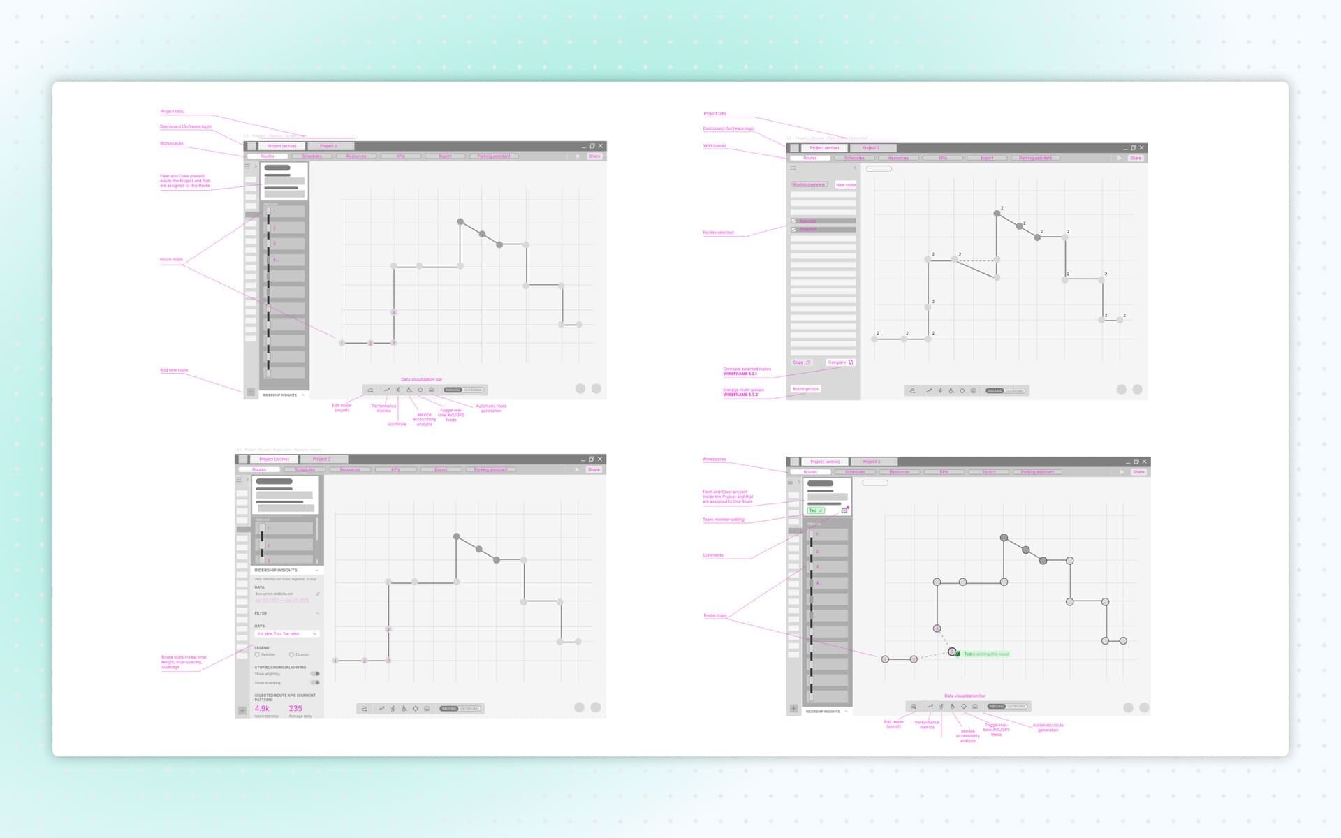
Wireframes: Routes Creation
I created fourteen screens dedicated to the creation and management of bus routes. The system supported advanced functionalities such as comparing multiple route variants, adding stops, vehicles or staff on the fly, and using drag-and-drop interactions to adjust paths.
To simplify the visualization of performance, accessibility, ridership, travel time and traffic conditions, I designed a Data Visualization Bar. This allowed users to toggle different data layers during route planning or editing. I also included real-time collaboration features, enabling users to see colleagues’ modifications as they occurred and leave comments directly on the active route.
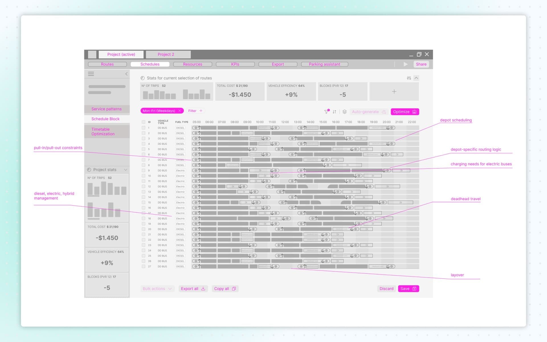
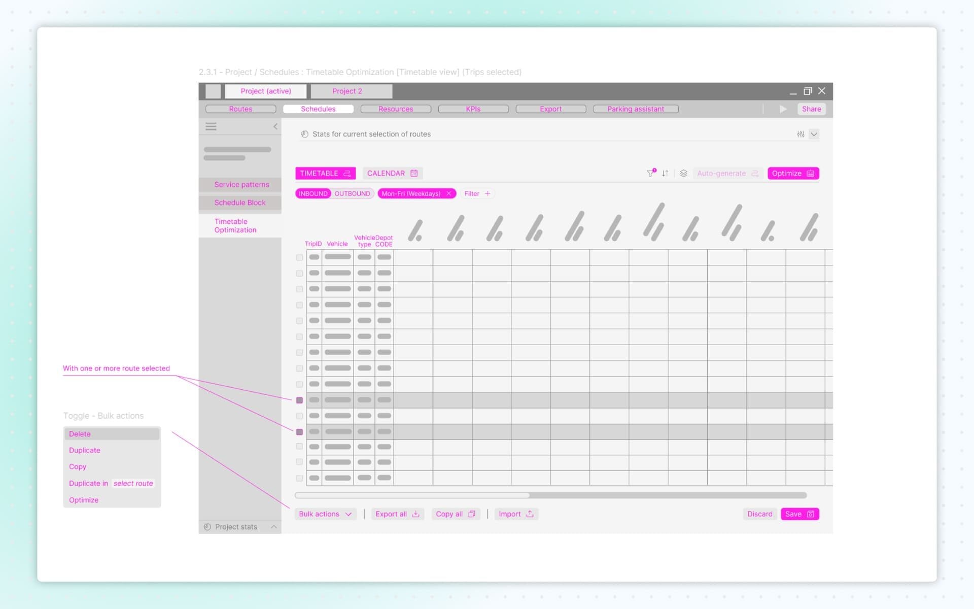
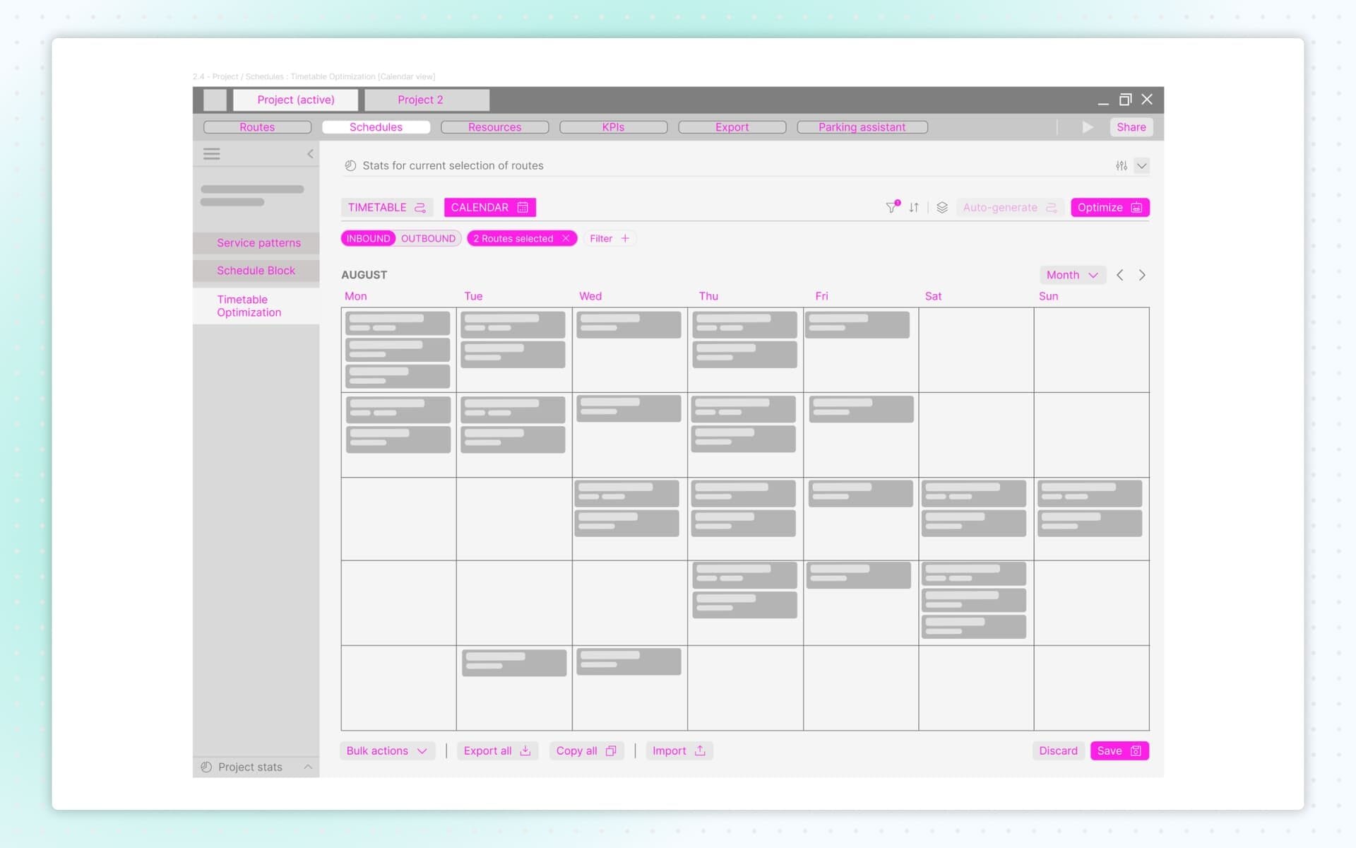
Wireframes: Schedules
Scheduling is one of the most complex responsibilities of a transit planner, involving depot constraints, pull-in/pull-out logic, vehicle charging needs (for electric, hybrid or diesel fleets), deadhead travel, layover management and service continuity.
To structure this complexity, I divided scheduling into three key parts:
- Service Patterns Settings that act as templates, later used to build and modify routes.
- Schedule Block A detailed view that displays all routes, relationships and operational data in one place.
- Timetable Optimization – Timetable & Calendar Automatically synchronizes calendar updates across planning and scheduling modules, simplifying coordination between teams.
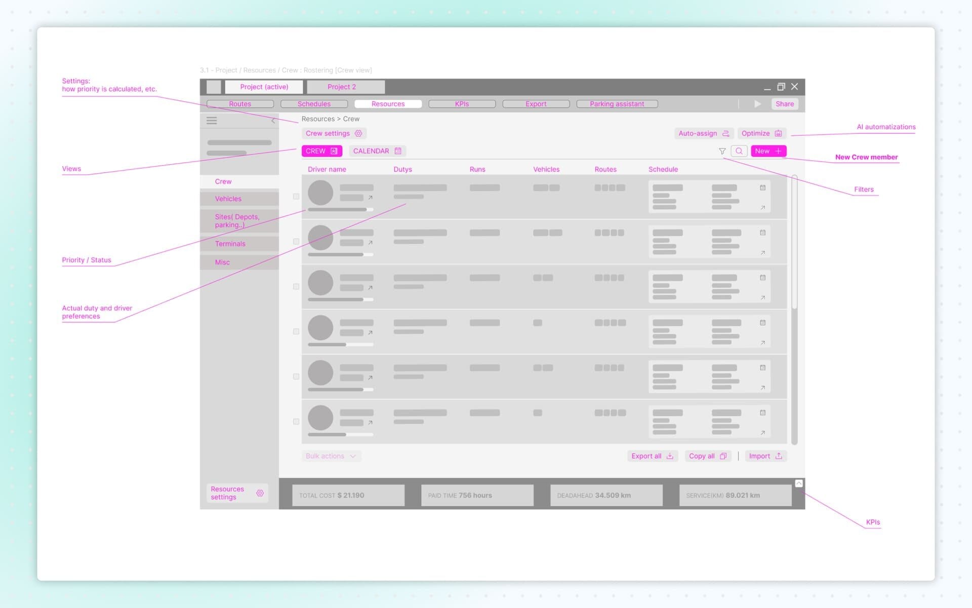
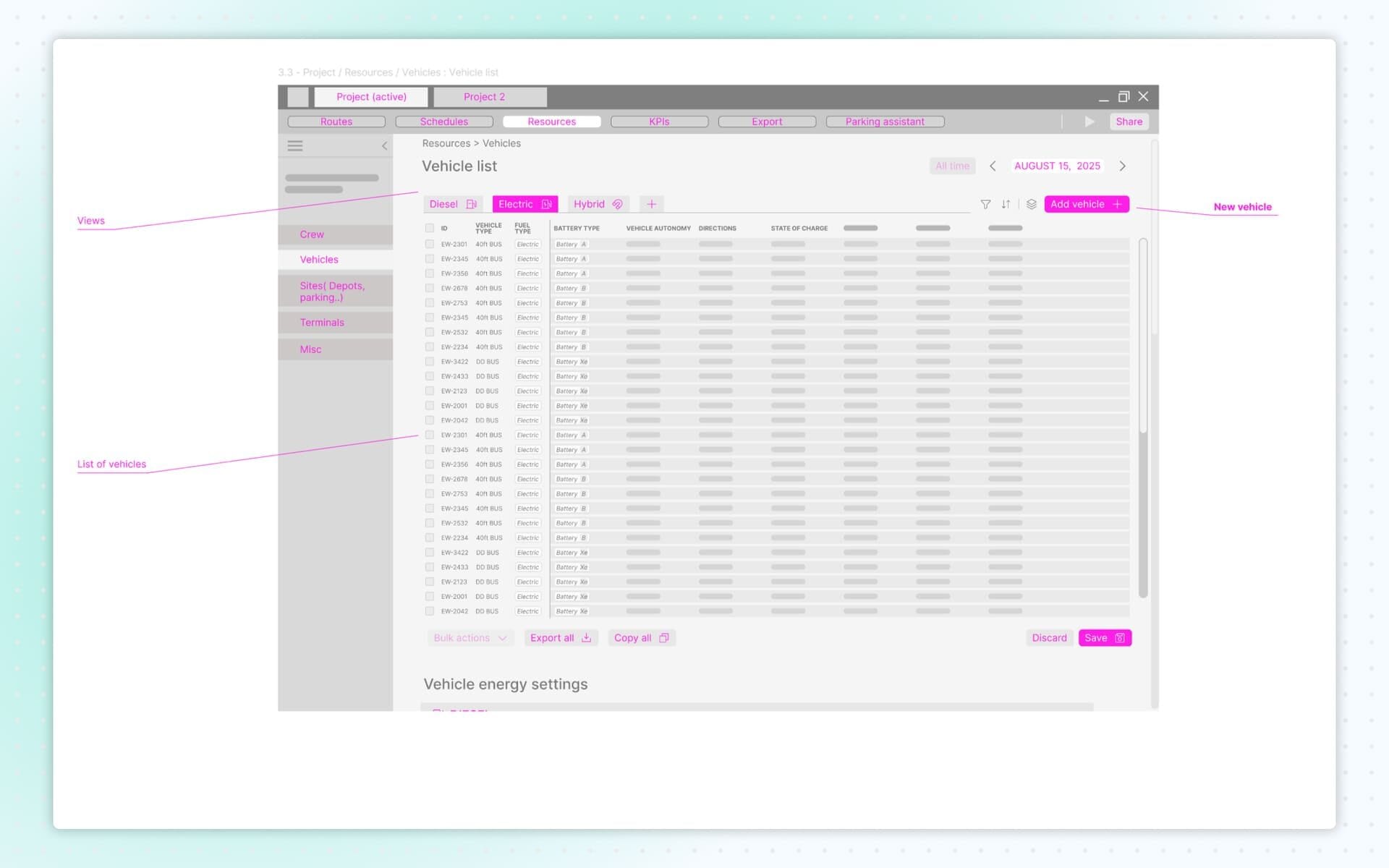
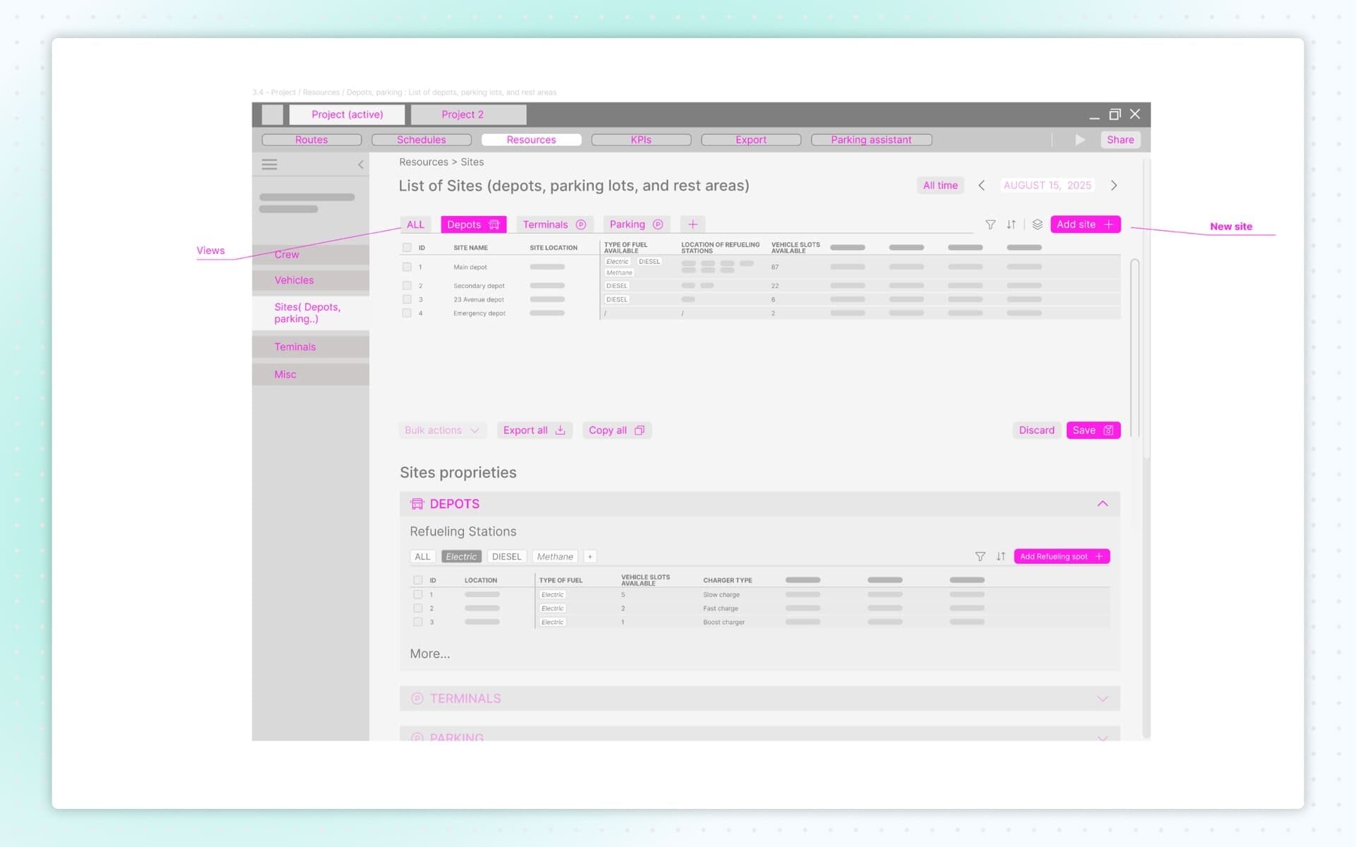
Wireframes: Resources
The Resources module covered crew, vehicles, sites (depots, parking areas) and terminal-related elements.
I designed the screens to make switching between roster, vehicle lists and route planning simple and intuitive. Every resource added during route creation could be edited here. Each resource could be assigned to a single project or made available system-wide.
The structure ensured clarity, control and quick access to logistical information.
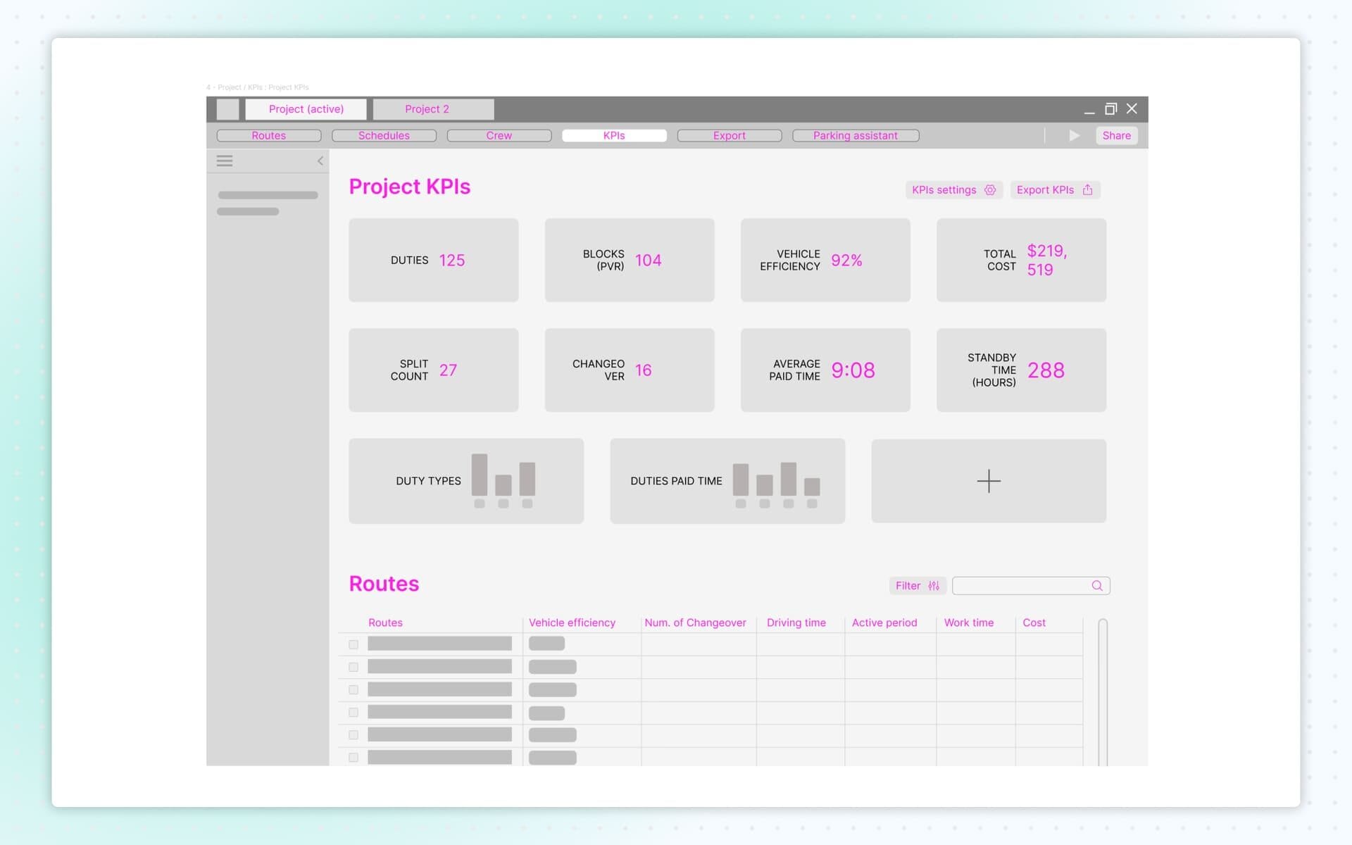
Wireframes: KPIs
The KPIs section display key performance indicators such as total vehicle hours, deadhead percentage, operator hours and cost estimates.
A dedicated export screen complemented the module, allowing users to generate reports for operations, planning, compliance and external presentations.
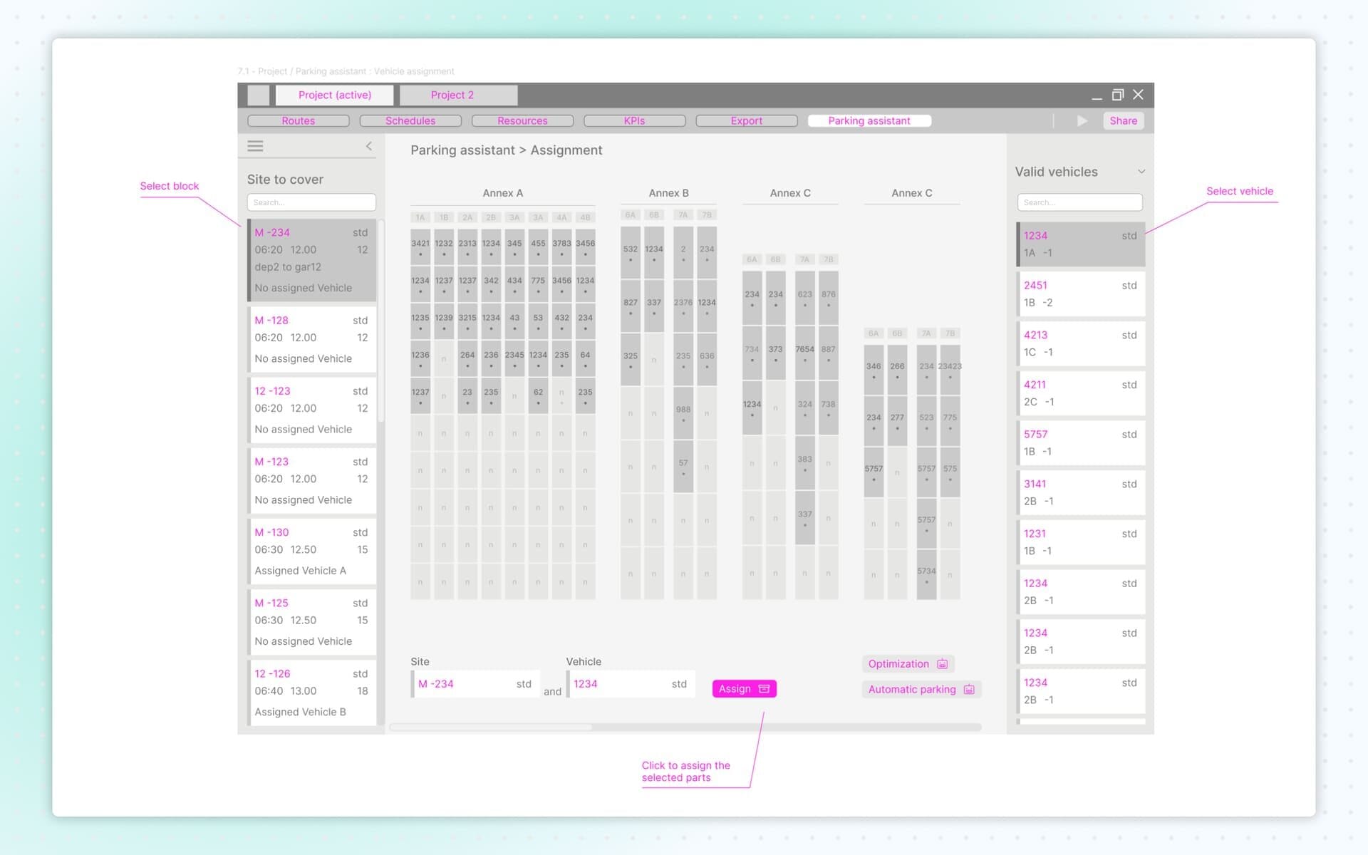
Wireframes: Parking Facilitator
The Parking Facilitator module helped manage where vehicles park, charge or stage between trips. These screens ensured planners could keep depots organized and maintain efficient vehicle flow.